Welcome to my design canvas
An infinite Figma-like canvas where you can pan, zoom, draw and explore freely. Jump straight in a project or navigate around to discover everything by yourself.
The app was built using the best and simplest libraries and frameworks available. Next.js and React, styled with Tailwind v4 design tokens and Radix UI primitives animated with Motion. Data stored in Postgres via Drizzle ORM, with Supabase handling auth.
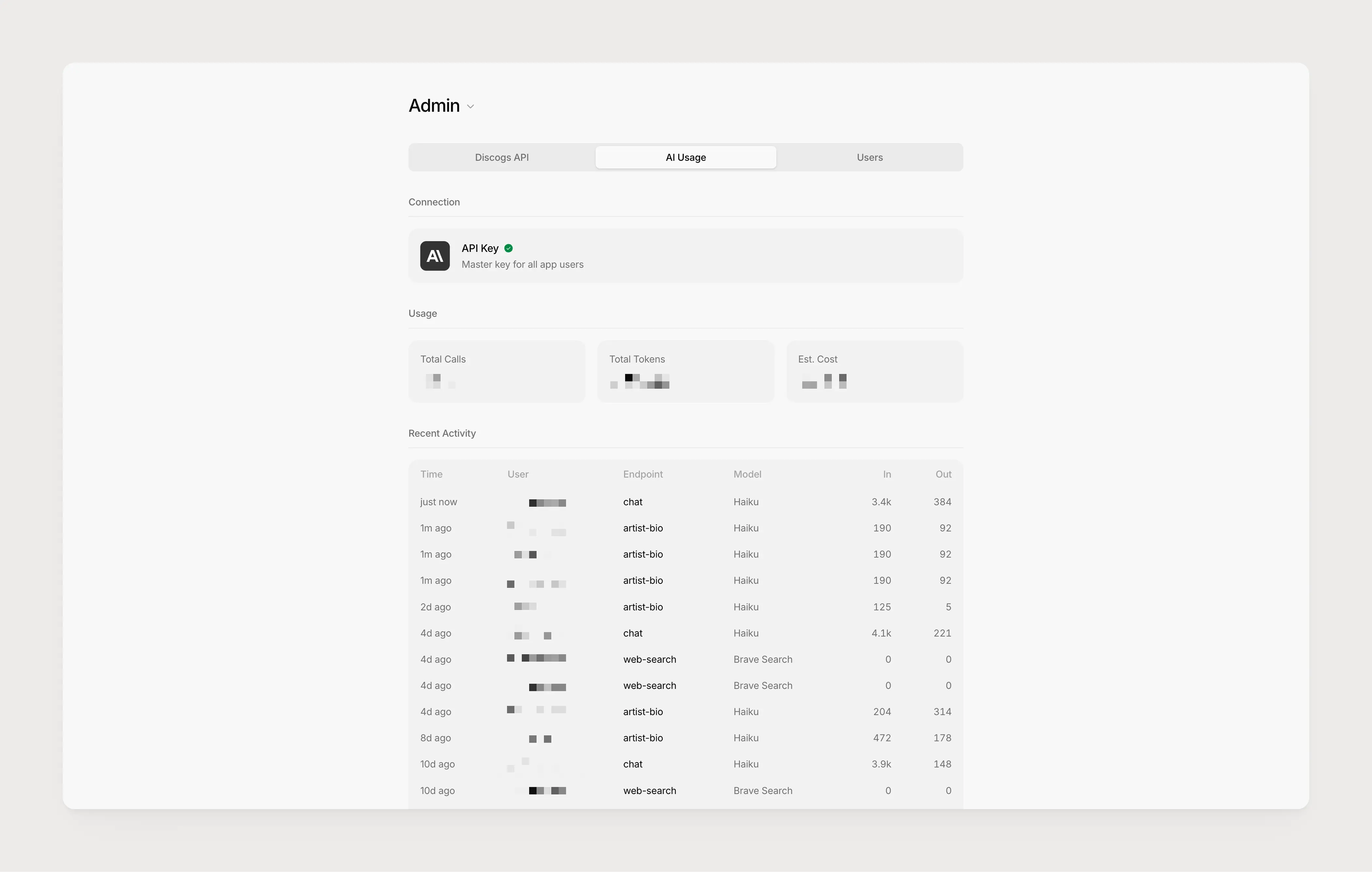
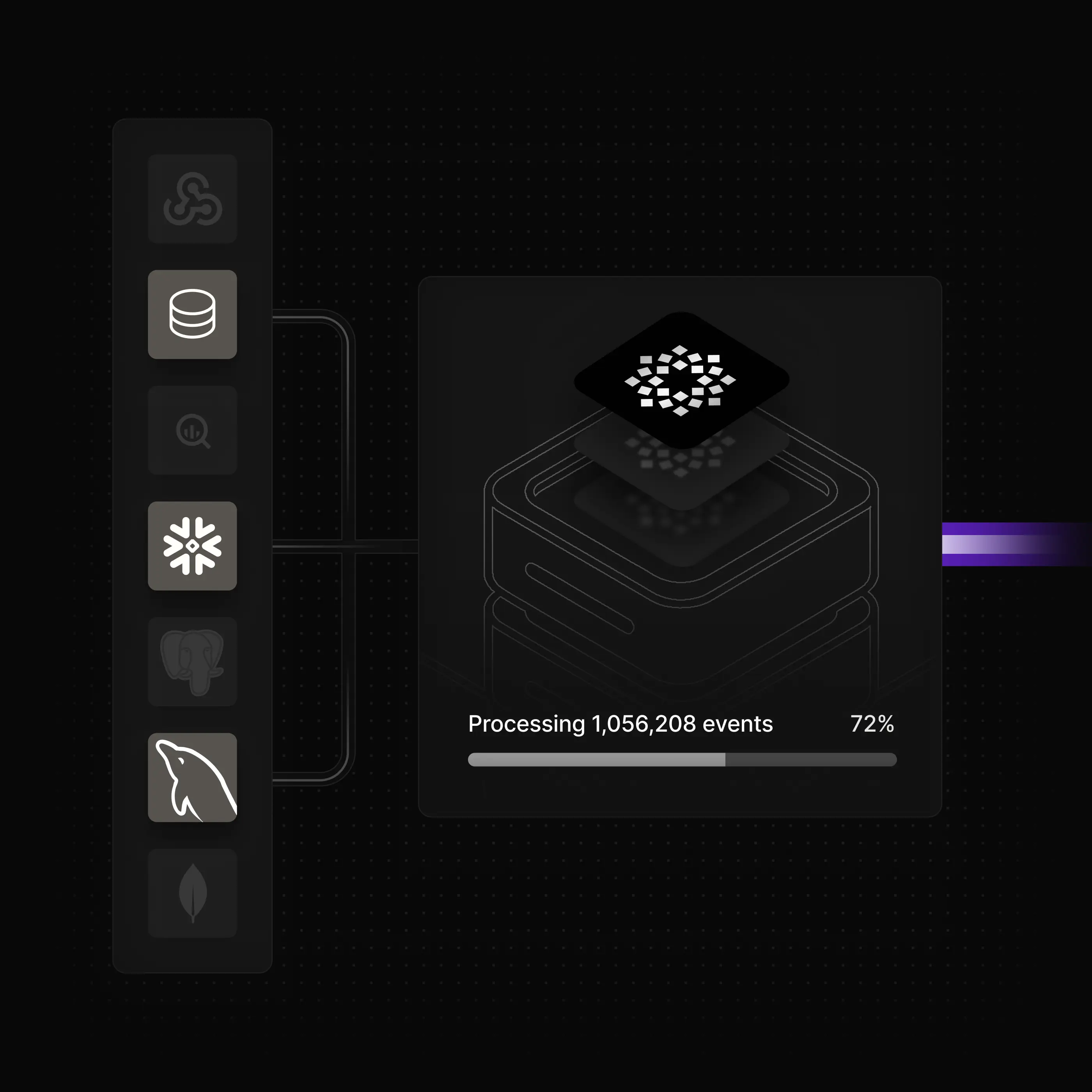
The main challenge for the app was to handle the API limit rate from Discogs. They allow 60 calls per minute, which can become quite tricky when you have multiple users at the same time searching for their records.
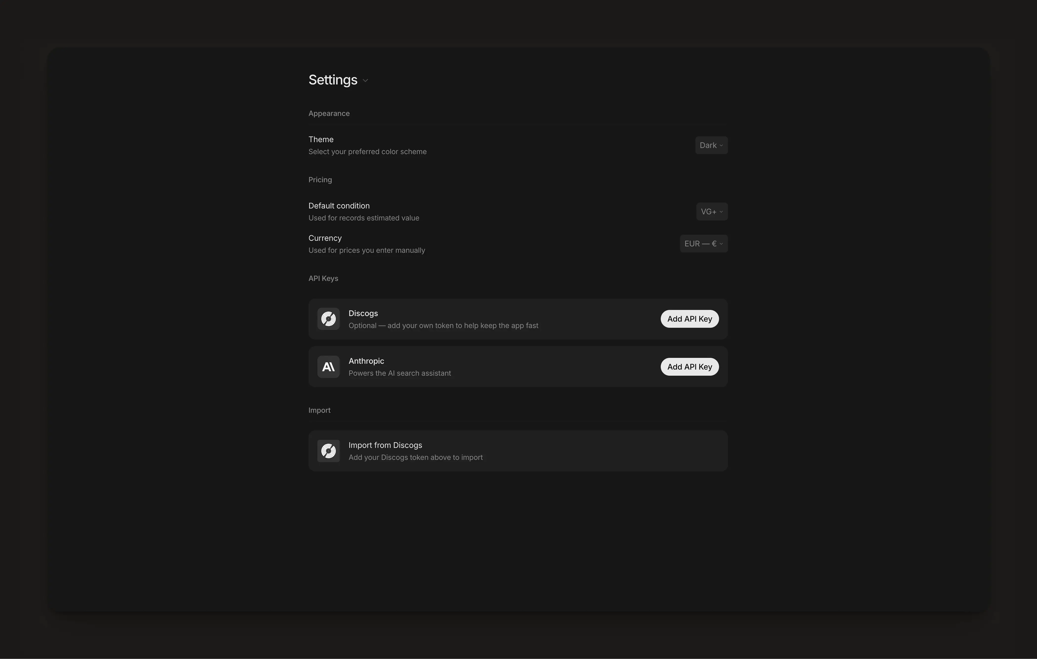
As of today, this feature is gated for users who added their Anthropic API key in their settings page, to avoid usage. I’ve got a key loaded with $10 of credits for beta testers and put quite a high limit on input and output to manage consumption.
Unfortunately, the brand does not exist anymore and the website is not live anymore.
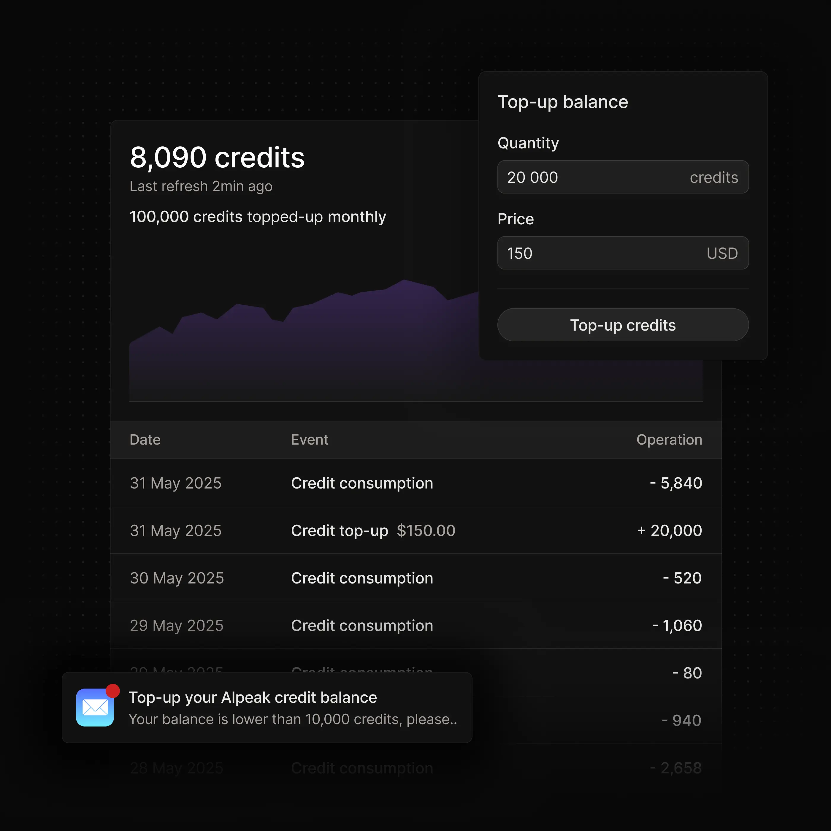
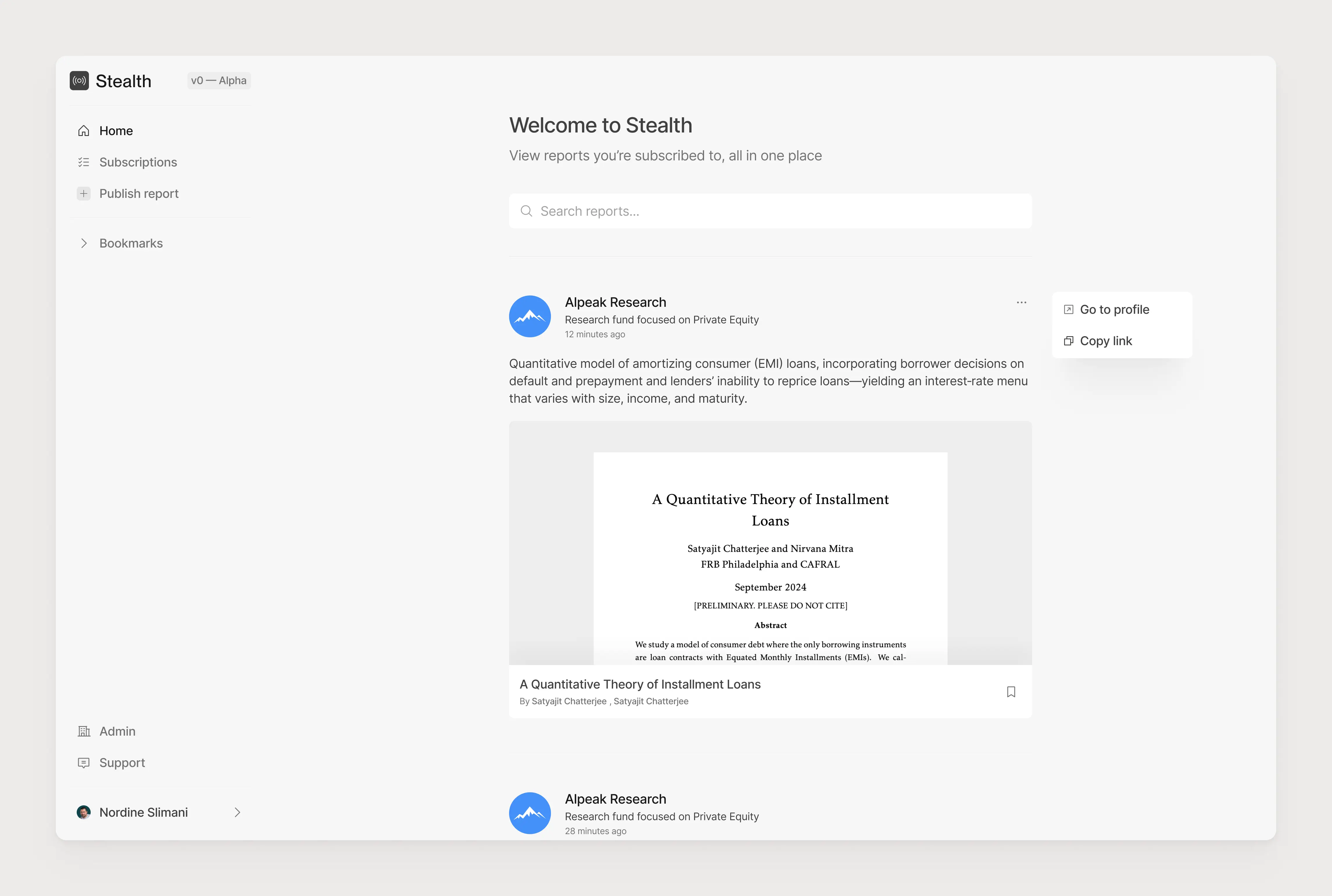
This feature was one of the main drivers that led me to build Recccords ; having a public online page where you can show your records collection to your friends and family
I still need to find a reliable way to compute the estimated value directly from Discogs ; so far, the API only return the lowest price, which is not reliable data to firmly give a value.
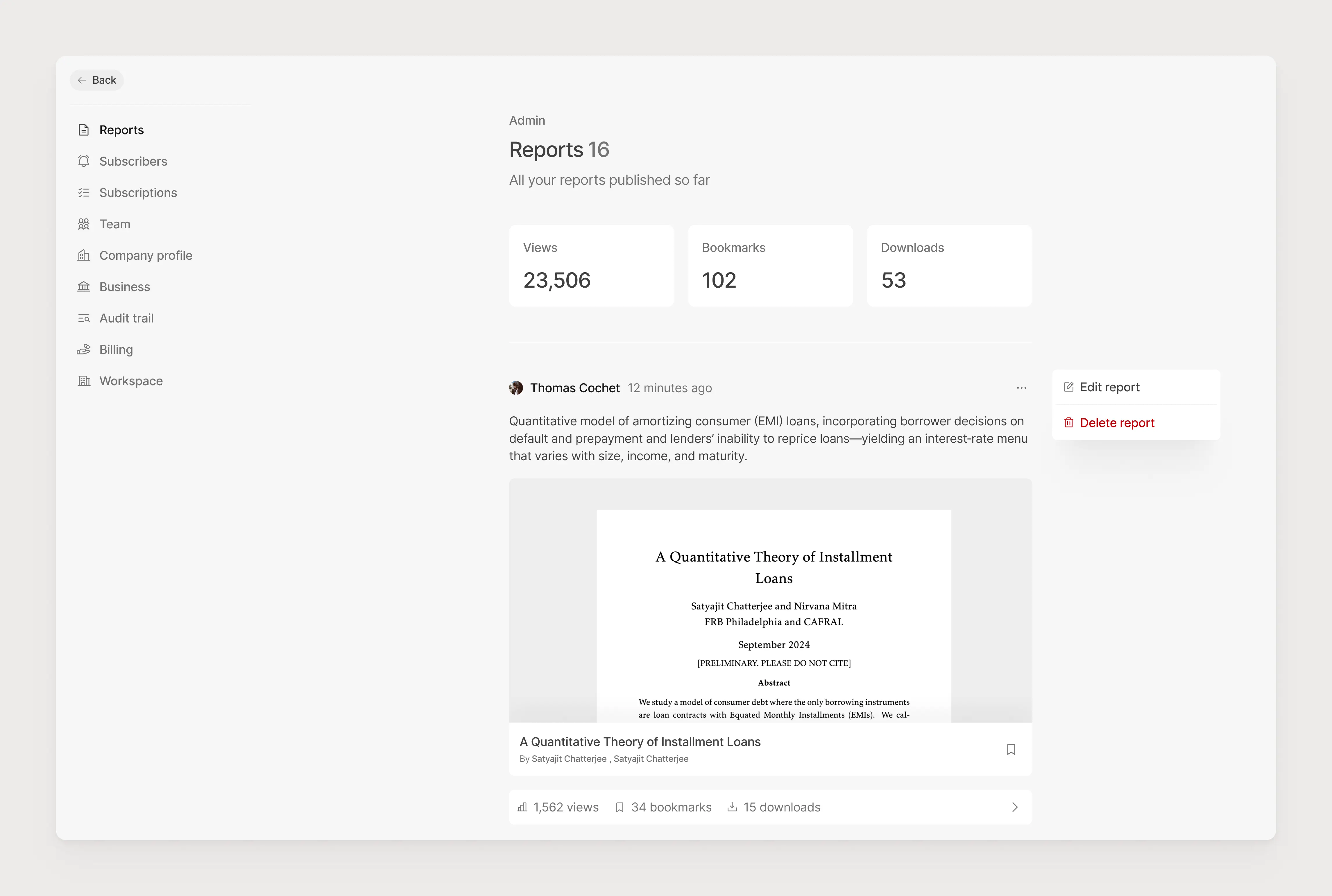
This Admin page was mostly made to monitor that I’m not over-spending on tokens.
They then hired a marketing lead and have been iterating on the identity, website and visual language to make it their own.
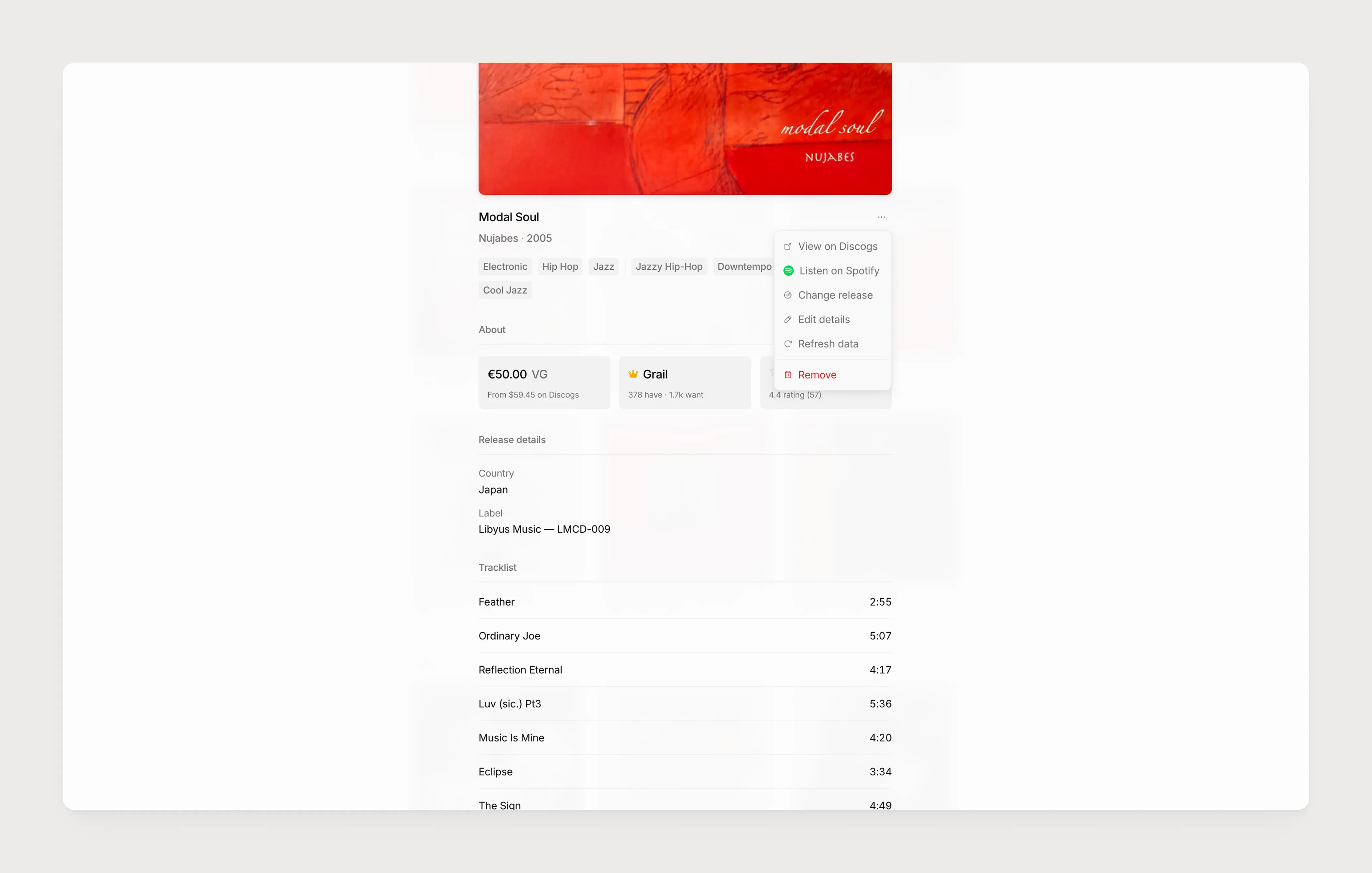
Users have access to a wide range of actions including viewing the original pressing on Discogs or opening it on Spotify through a smart built with the public Spotify API.
This led me to take 2 major decisions: Users can bring their own Discogs API key, which will be used for their queries instead of the master one There is a hard limit per request per customer per minute, and then a graceful degradation based on a queue system
Since Discogs is publicly dumping their database every 2 weeks, I wrote a script to add the 15,000 most popular records to my database, so users will not have to use any API calls when querying one of these, drastically reducing the potential reach of the fatal rate limit that would freeze the platform.
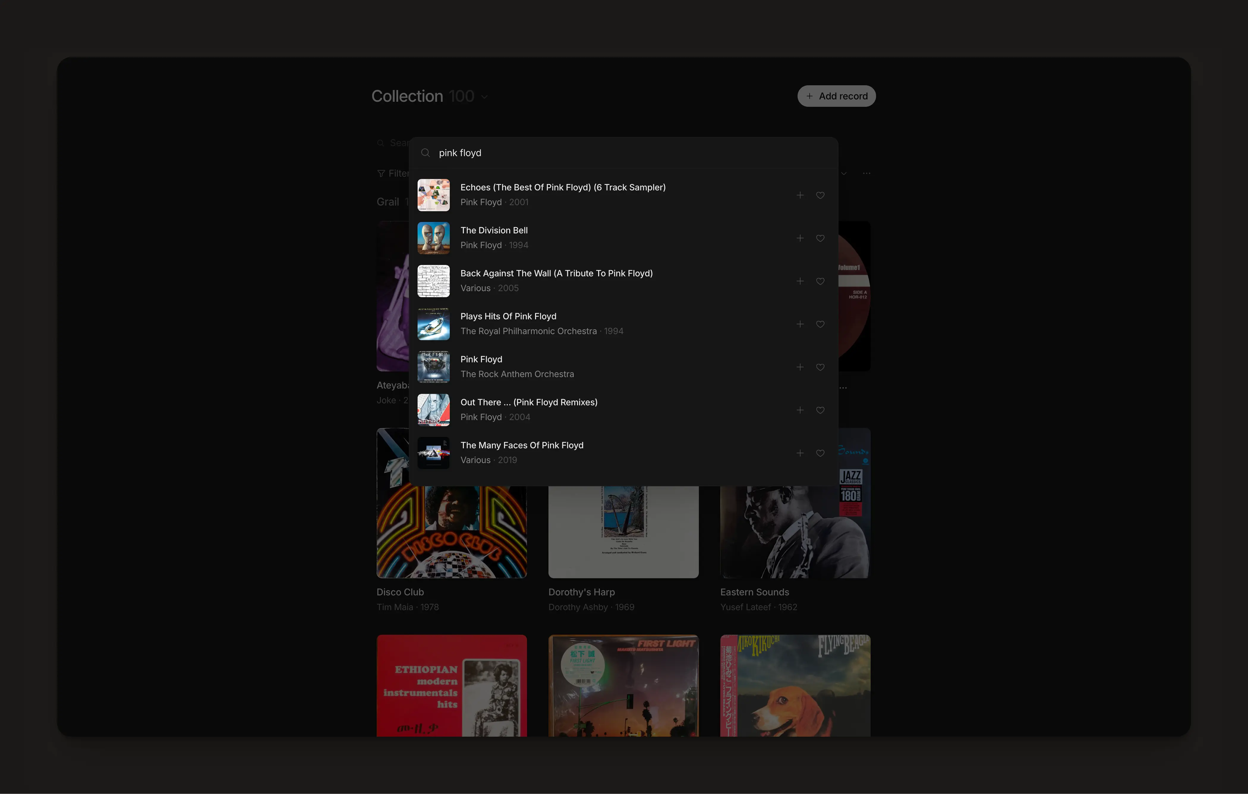
Users can open a modal to search for their records, using a dynamic search with multiple parameters to display the most relevant record for each query, entirely using the available information on the Discogs API.
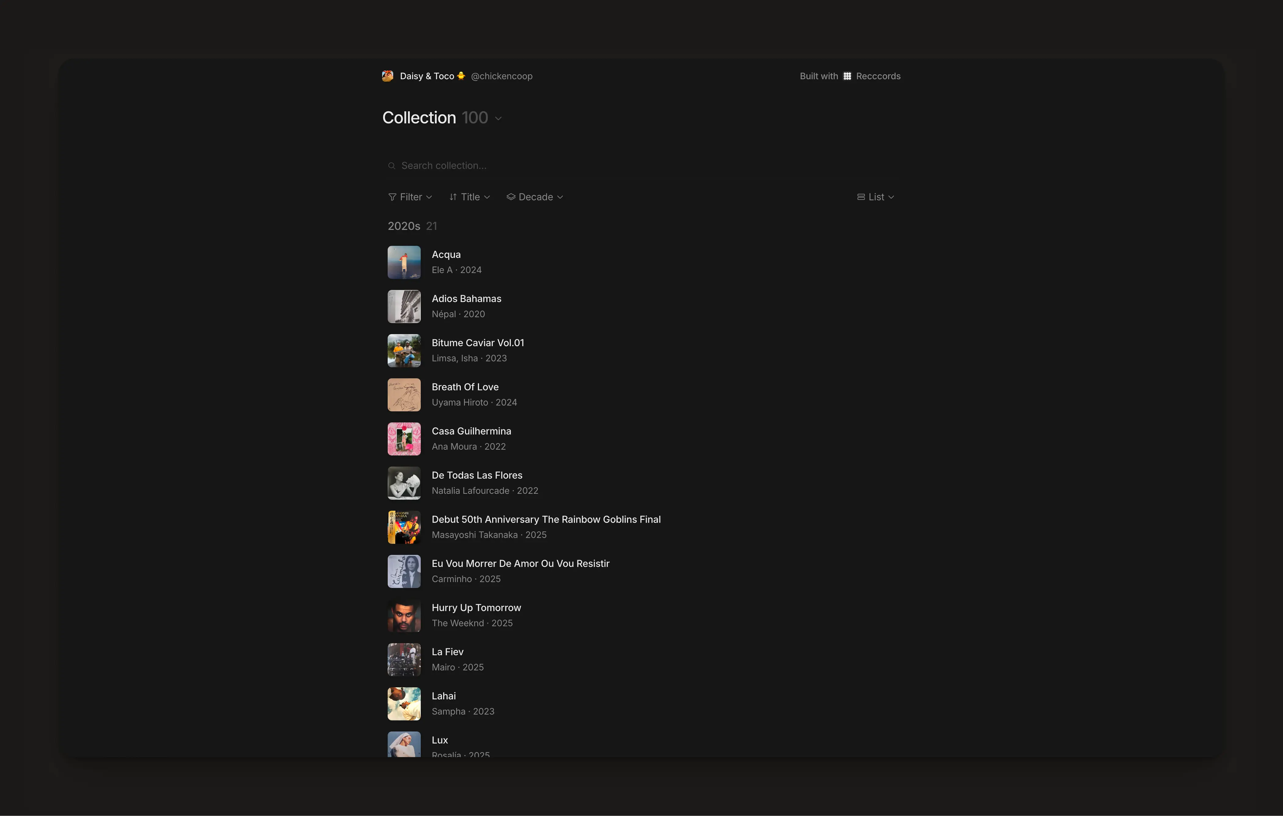
Each user has their own public page, with the same features as the main collection page except it’s read only. Users can define the default view, and let visitors sort, filter, search and see the details of every record on the collection.
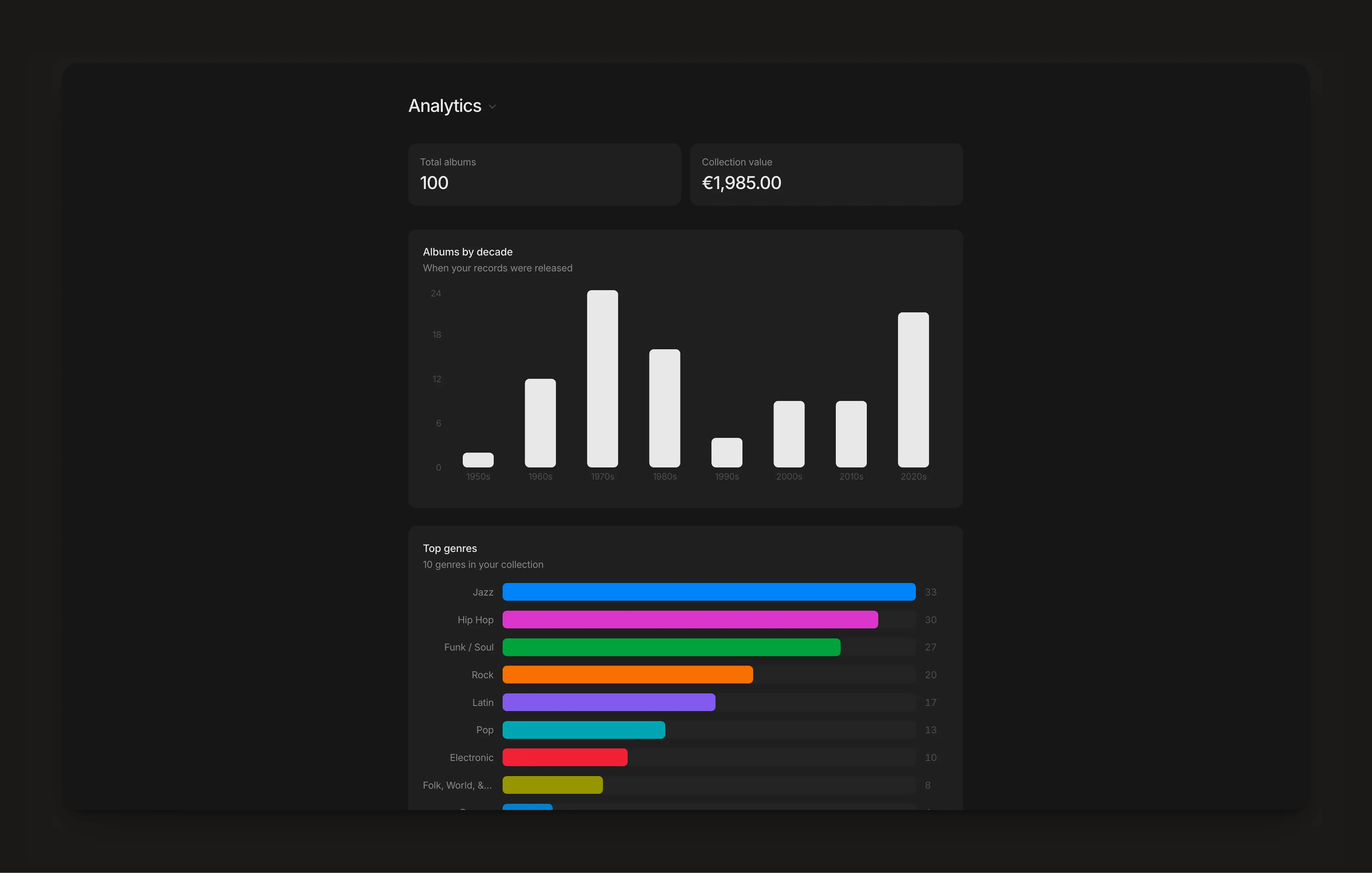
There’s built-in analytics that use the categories, year from Discogs and estimated value from the user. This gives visibility on total collection value, who are the top artists and get a dynamic overview than an spreadsheet couldn’t.
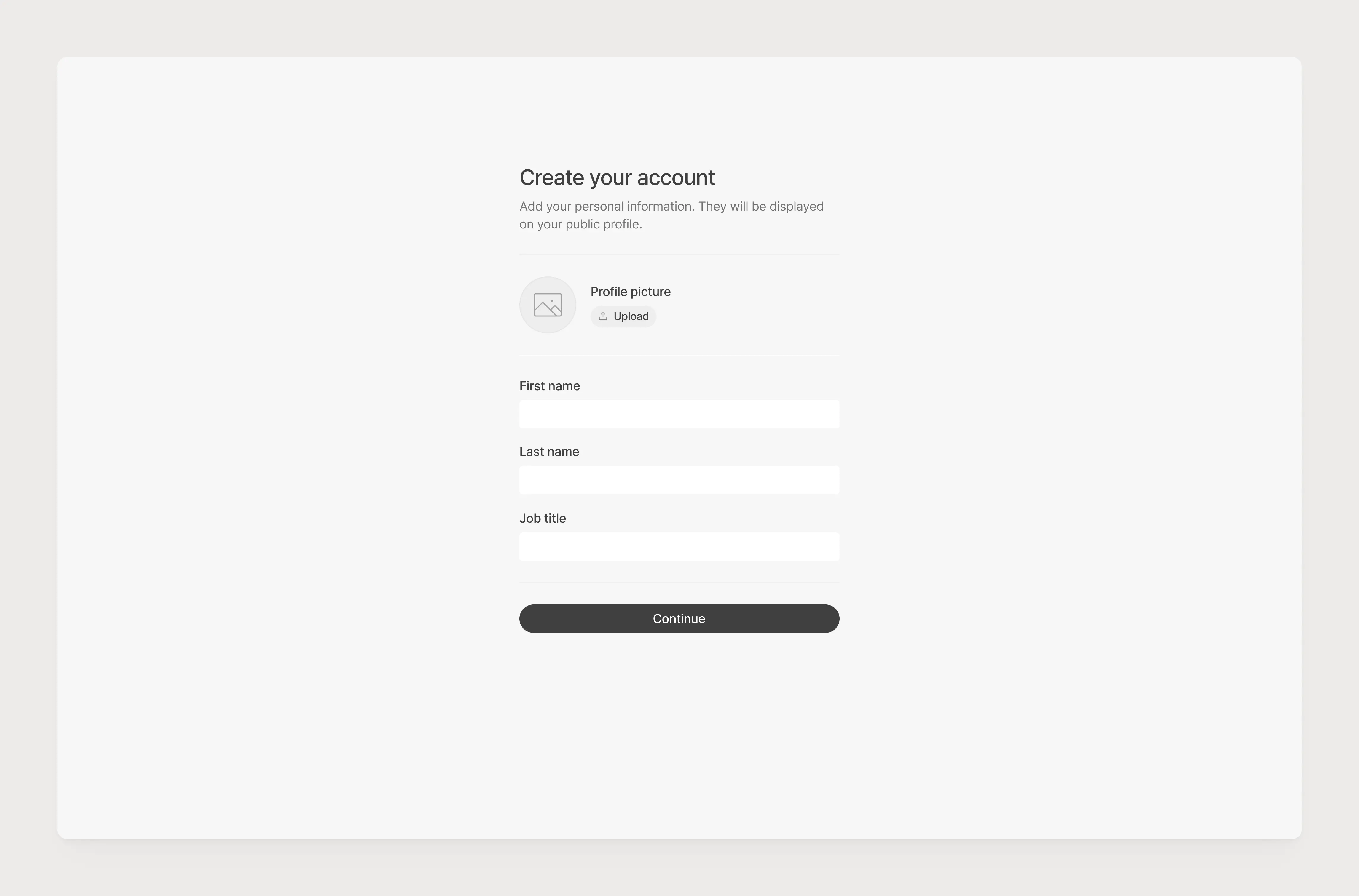
Users can configure their account the way they want, to improve efficiency while adding a record to their collection, manage their API keys and import their Discogs data in 1 click.
Users can configure their account the way they want, to improve efficiency while adding a record to their collection, manage their API keys and import their Discogs data in 1 click.
The app itself is very minimalistic, putting the spotlight on the vinyl covers. Greatly inspired by Linear, Recccords was build to easily create and complete your collection.
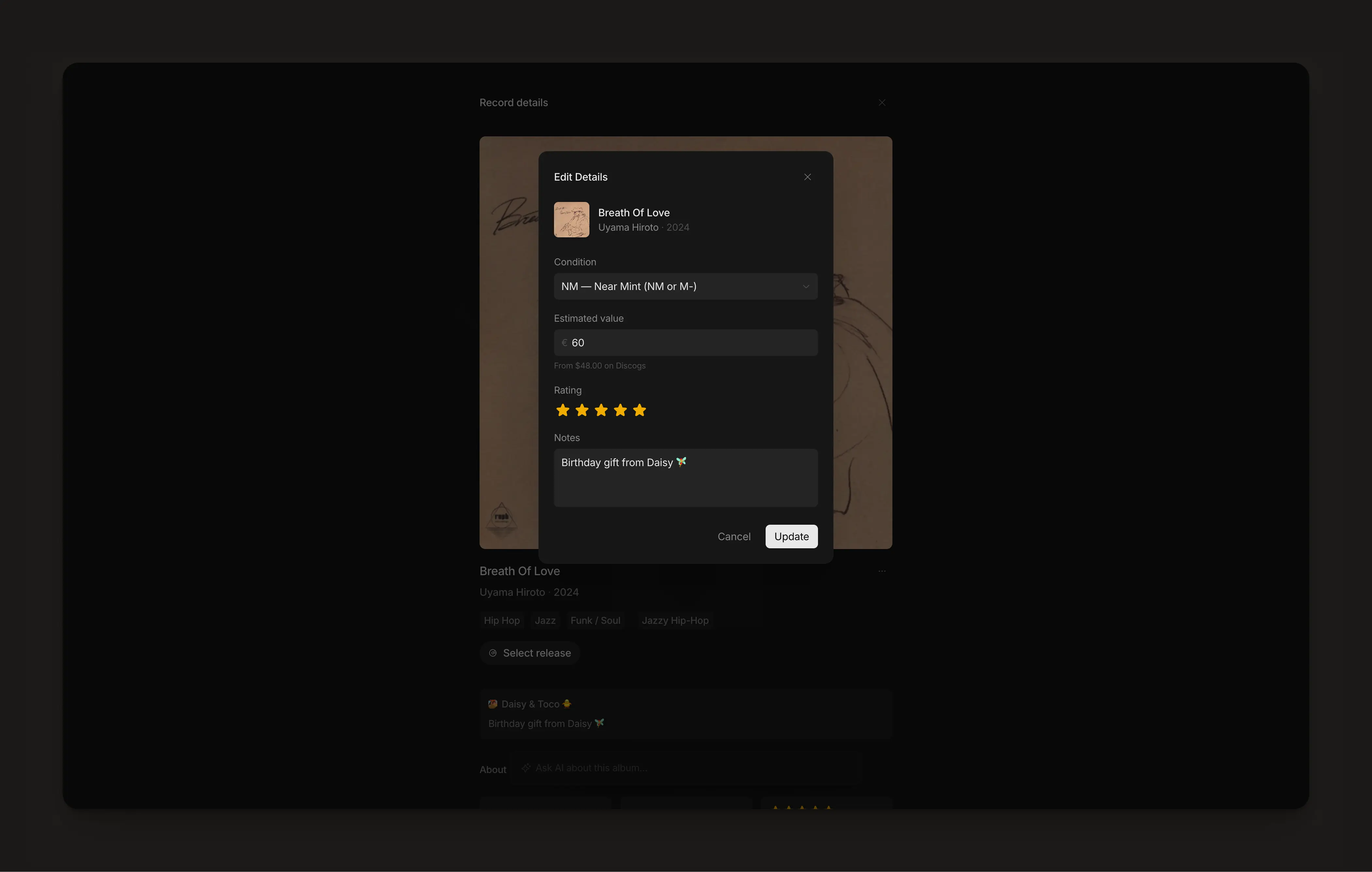
When the user finds their record, they can add the condition, estimated value, rate the album and write a little note to add any meaningful information about it.
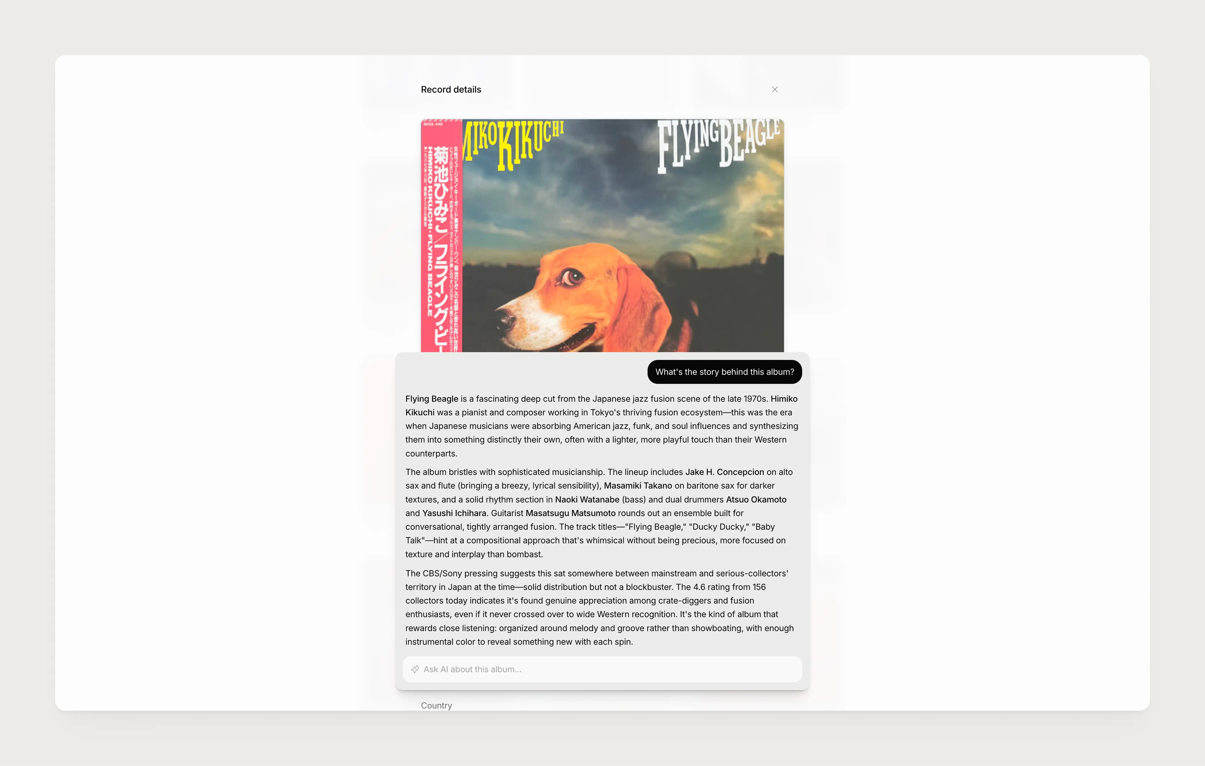
On the album details view, the user benefits from the heavily tagged record information from Discogs including year, genre, release details, tracklist and an artist biography that has been enhanced by an AI algorithm.
Users can ask questions about the record to a native AI chat. It’s pretty straightforward, and uses data from Discogs and queries a shortlist of websites specialized in music history.
As a vinyl collector and music enthusiast, I wanted to build an app from scratch with Claude Code. I took everything I learned while working with the engineering team at Hyperline, took some time to select the right tools, librairies and frameworks and built it over a weekend.
I didn't follow any academic classes to become a designer, I changed my career path from business to design and learnt by myself. In order to maximise my experience and make sure I'm up to the task, I took part in many side and freelance projects, ranking from branding, webdesign for B2B, B2C, Web3 and even consumer goods companies.
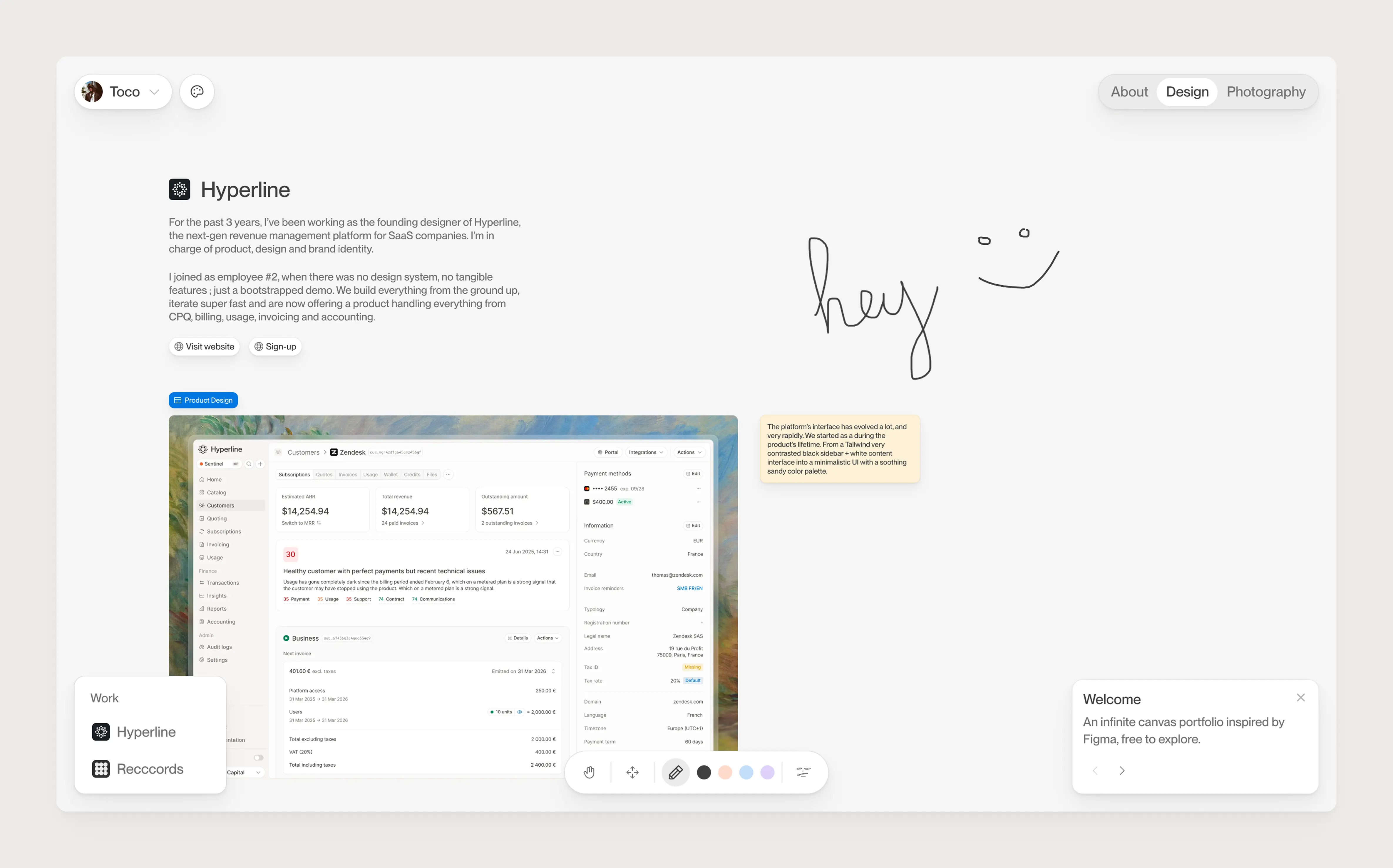
The platform’s UI has evolved a lot, and very rapidly. We started from a Tailwind-bootstrapped product, evolved into a very contrasted black sidebar and white content interface into a minimalistic and flat design with a soothing sandy color palette.
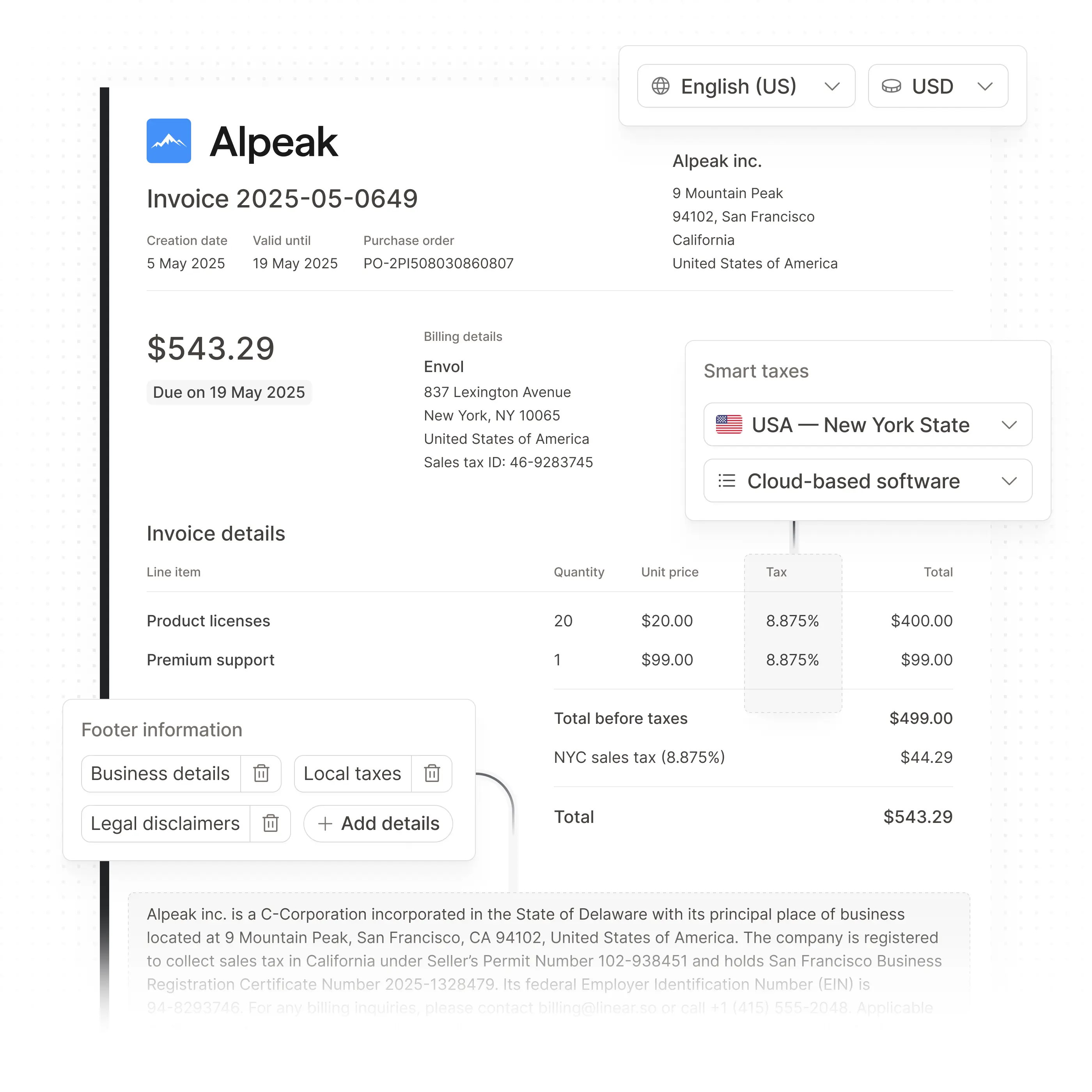
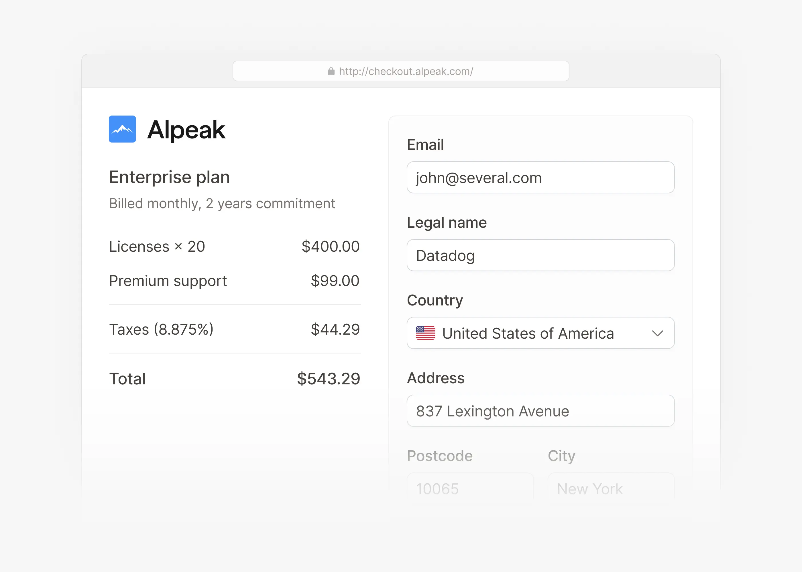
This page was built with an inbox-like design, where users can quickly switch from one product to another to add a new pricing for a specific currency or payment interval.
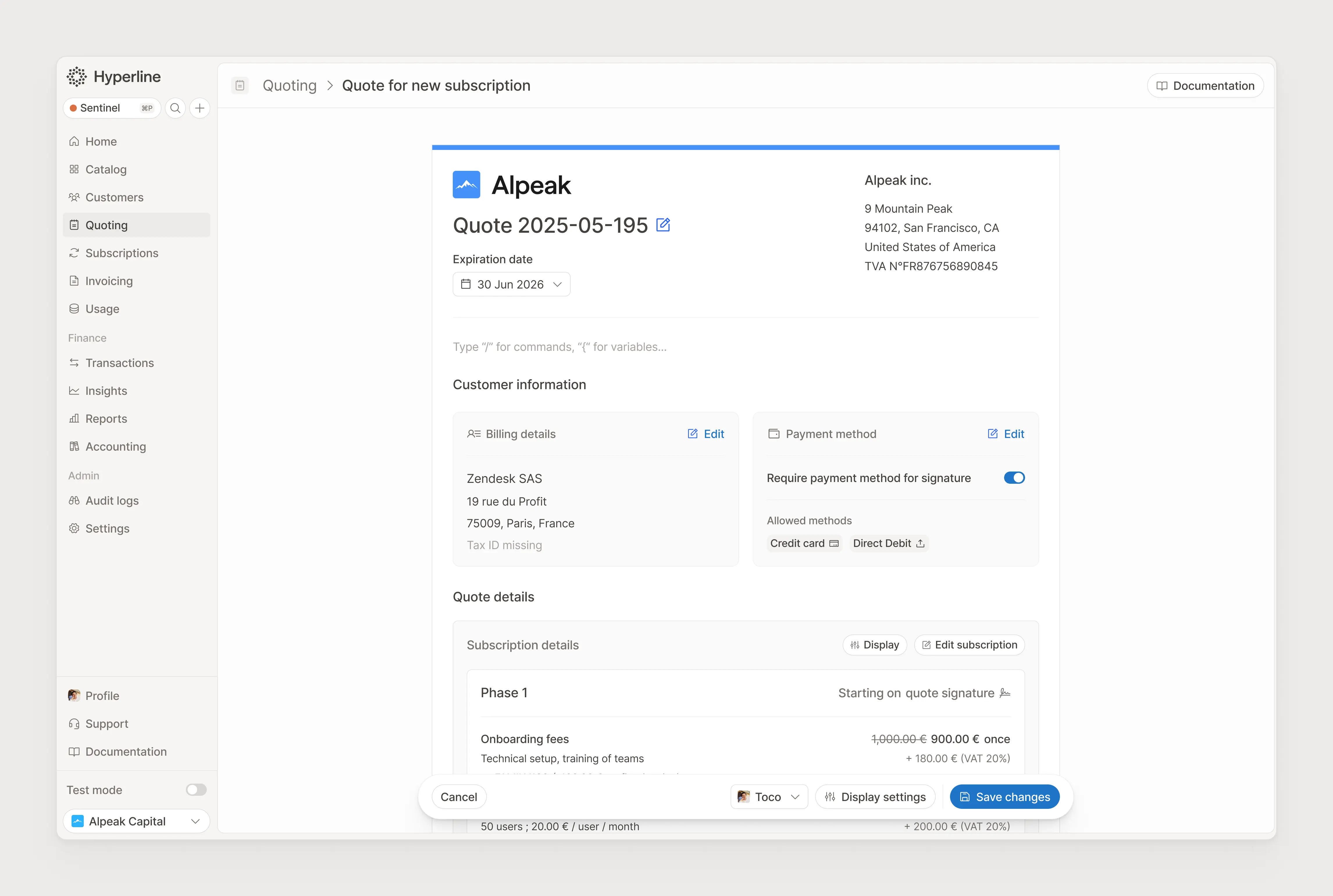
Creating a customisable document is quite a challenge, where we’re juggling between allowing users to customize, within the business constrain, while also supporting to be exported on an printable PDF file.
We worked on this form so many times, since it’s our core feature, that we were able to try a few layouts and gather ton of feedback.
The full-stack developer who is leading the project from the engineering end is now so knowledgeable that they could easily open their own accounting firm.
I led every website update from the ground up, working on the website structure, design, copy and visual content, closely following implementation with a webdev agency.
I hand-crafted a suite of 60+ illustrations, based on our design system and enhanced with visual details, composition and a comprehensive message.
They range from very simple illustrations showing our set of integrations, to very complex to explain the quote-to-cash process in details.
For the past 3 years, I’ve been working as the founding designer of Hyperline, the next-gen revenue management platform for SaaS companies. I’m in charge of product, design and brand identity.
I joined as employee #2, when there was no design system, no tangible features ; just a bootstrapped demo. We build everything from the ground up, iterate super fast and are now offering a product handling everything from CPQ, billing, usage, invoicing and accounting.
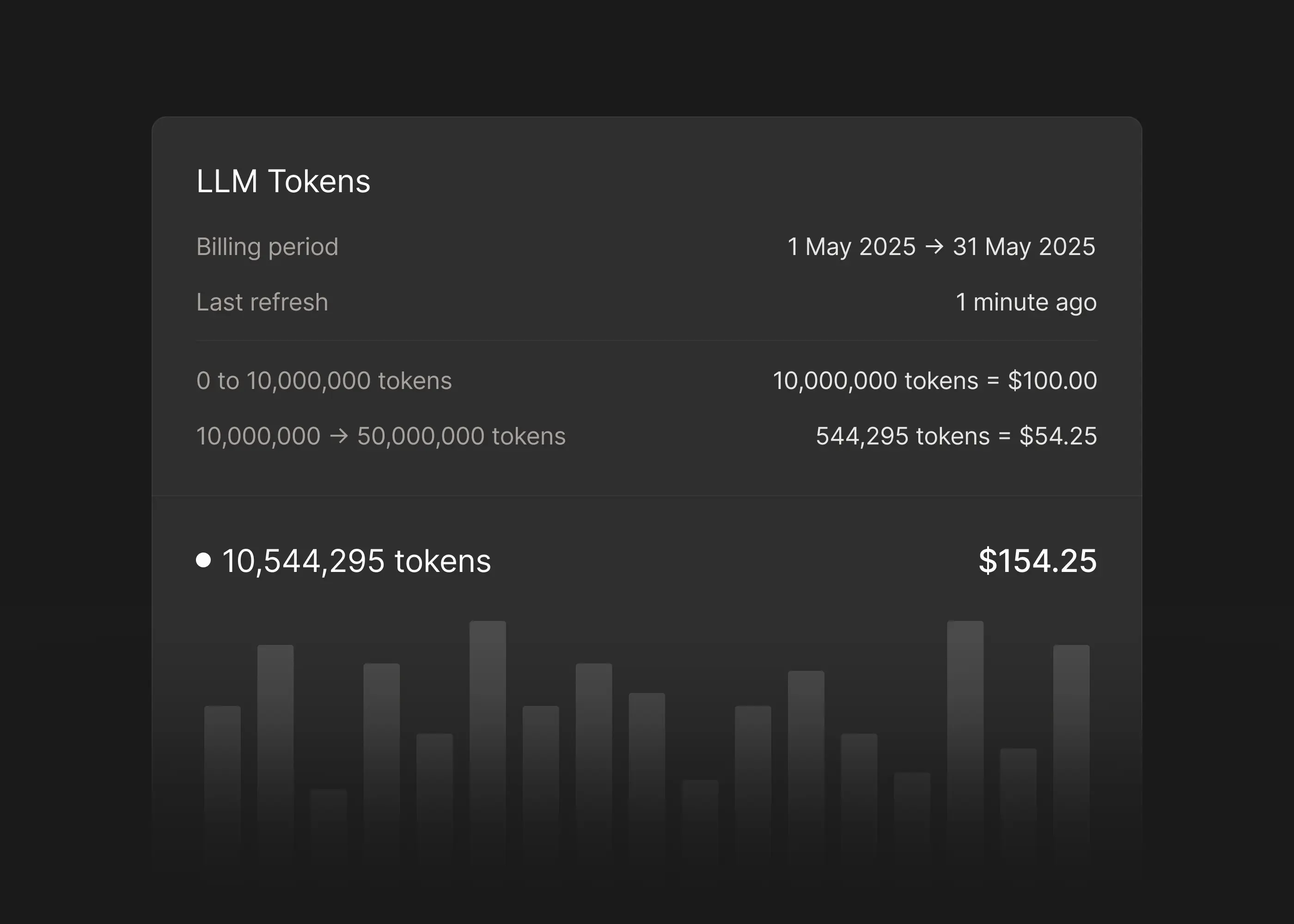
Hyperline is a tables, list and form-heavy product. We’re enabling our users to do a lot of things that require space to build like quotes, subscriptions, invoices... and yet give the user space to display dozens at once to get a quick overview to monitor their data at glance.
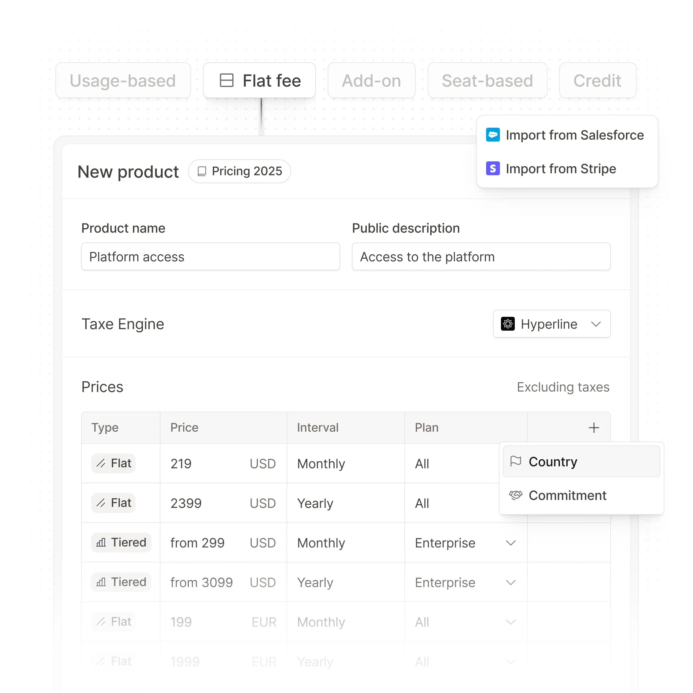
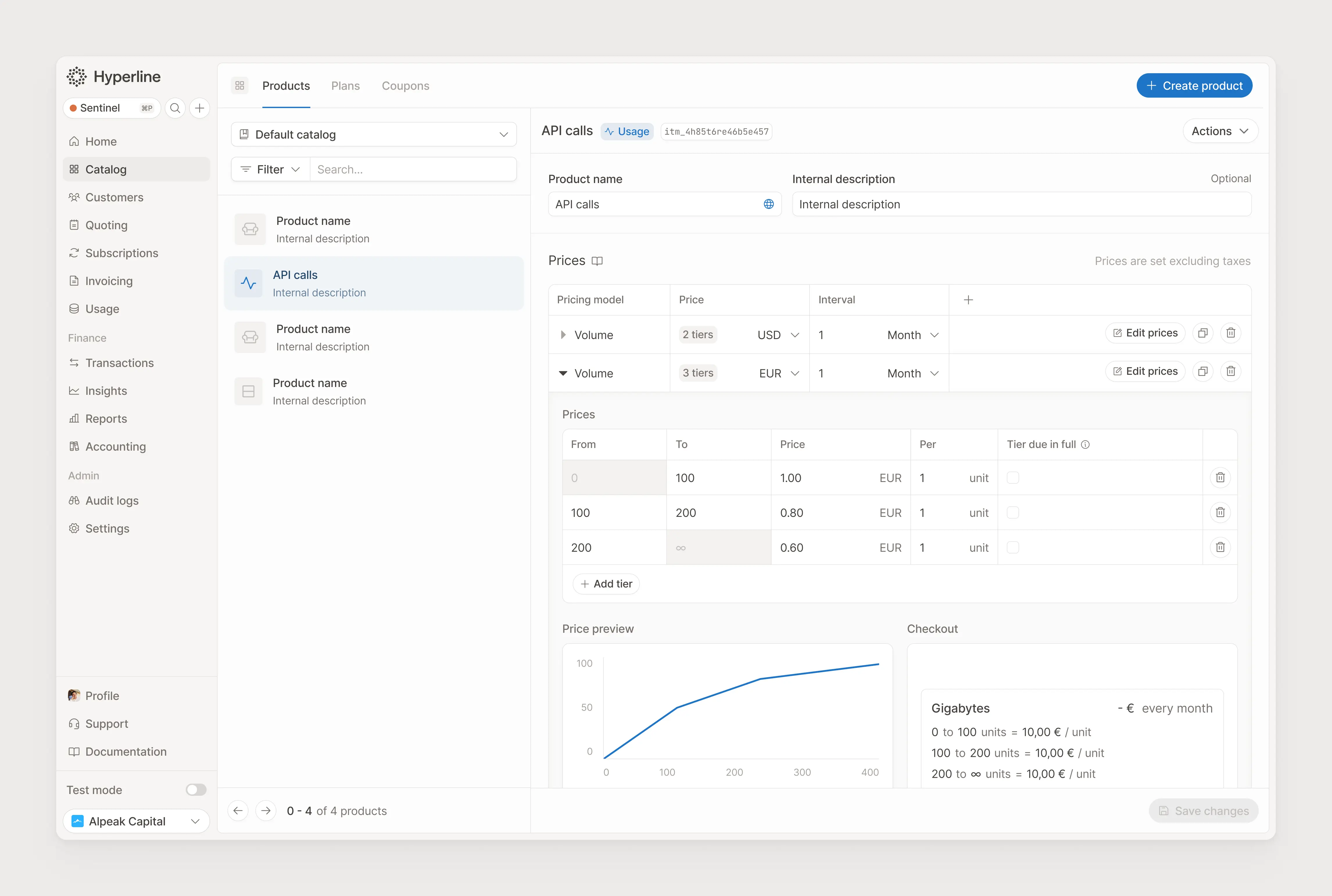
The product catalog is one of the first interfaces the user is faced with while configuring the platform. As users are coming from a spreadsheet format to build their pricing, we decided to create an expandable spreadsheet component where lines collapse into detailed views.
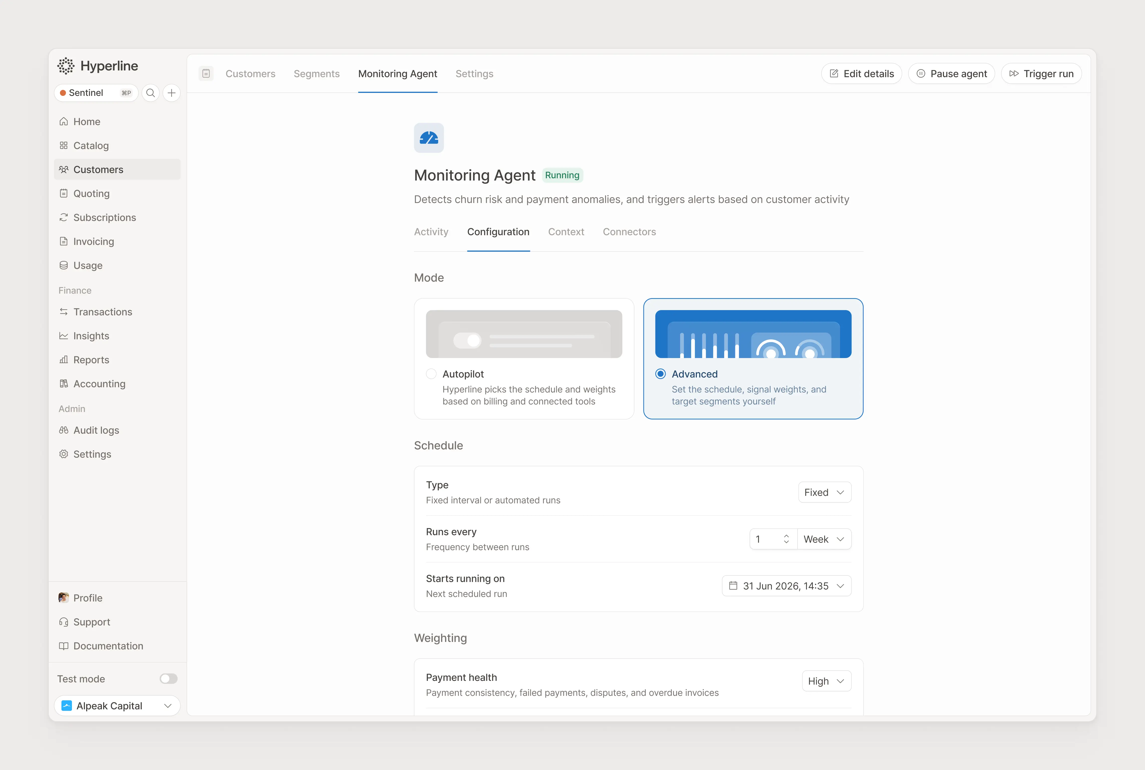
[BETA Feature] Users can configure an agent that monitors their customer base and attributes them a health score, based on integration data, payment and billing information and weighting set.
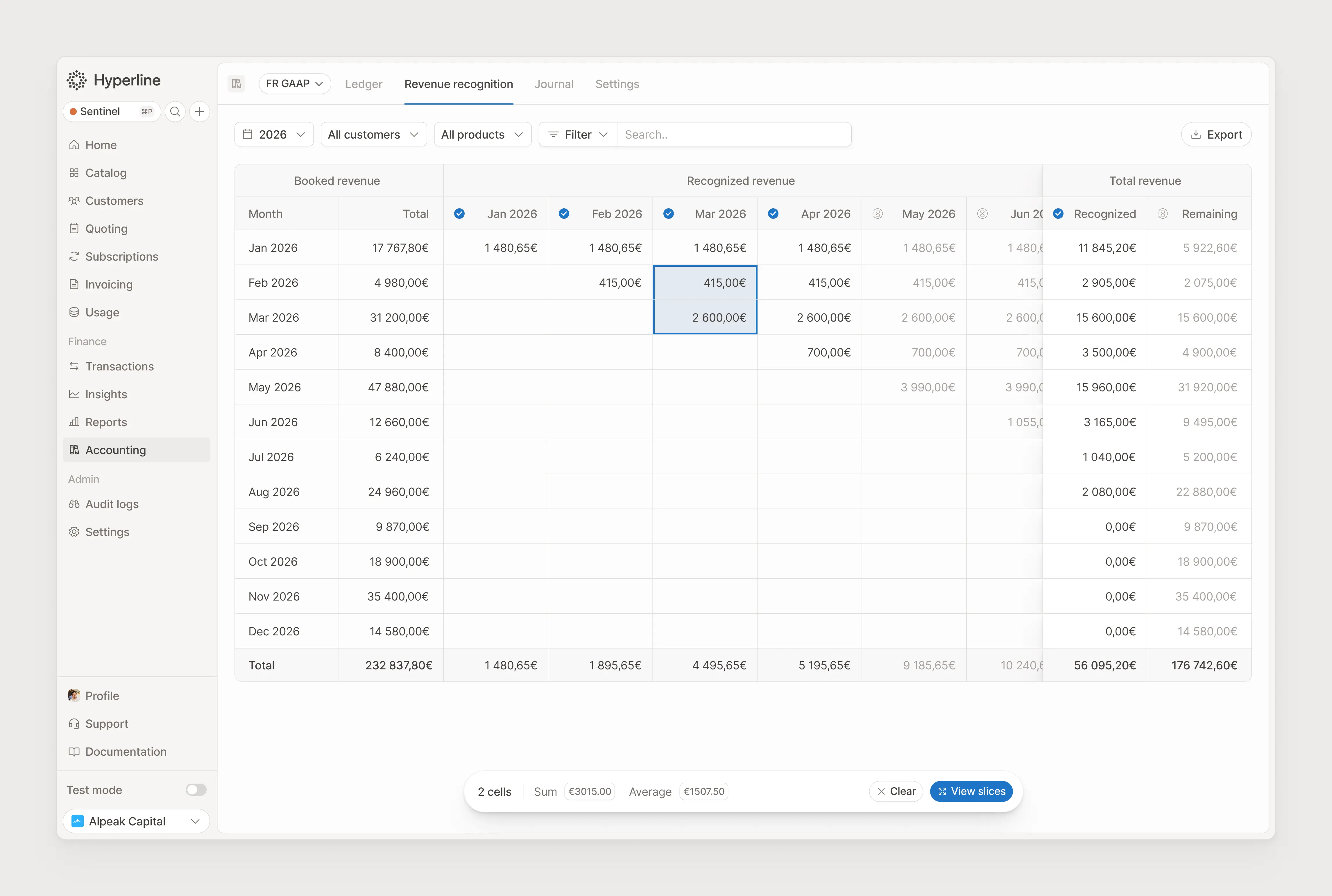
Revenue Recognition is one of the most complex parts of our accounting module, allowing finance users to decide how they want to allocate the revenue based on the moment it was realized, not invoiced.
This comes with a whole set of rules that are dynamically set for each product type, and generates accounting journal entries.
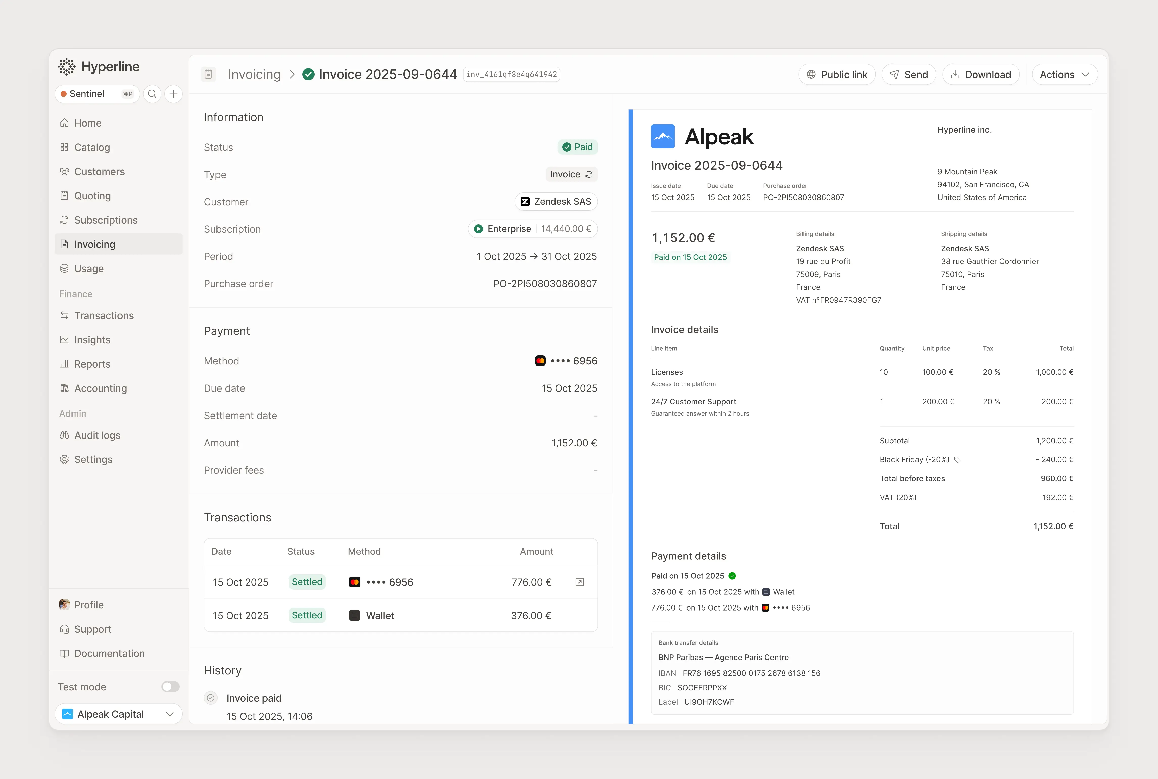
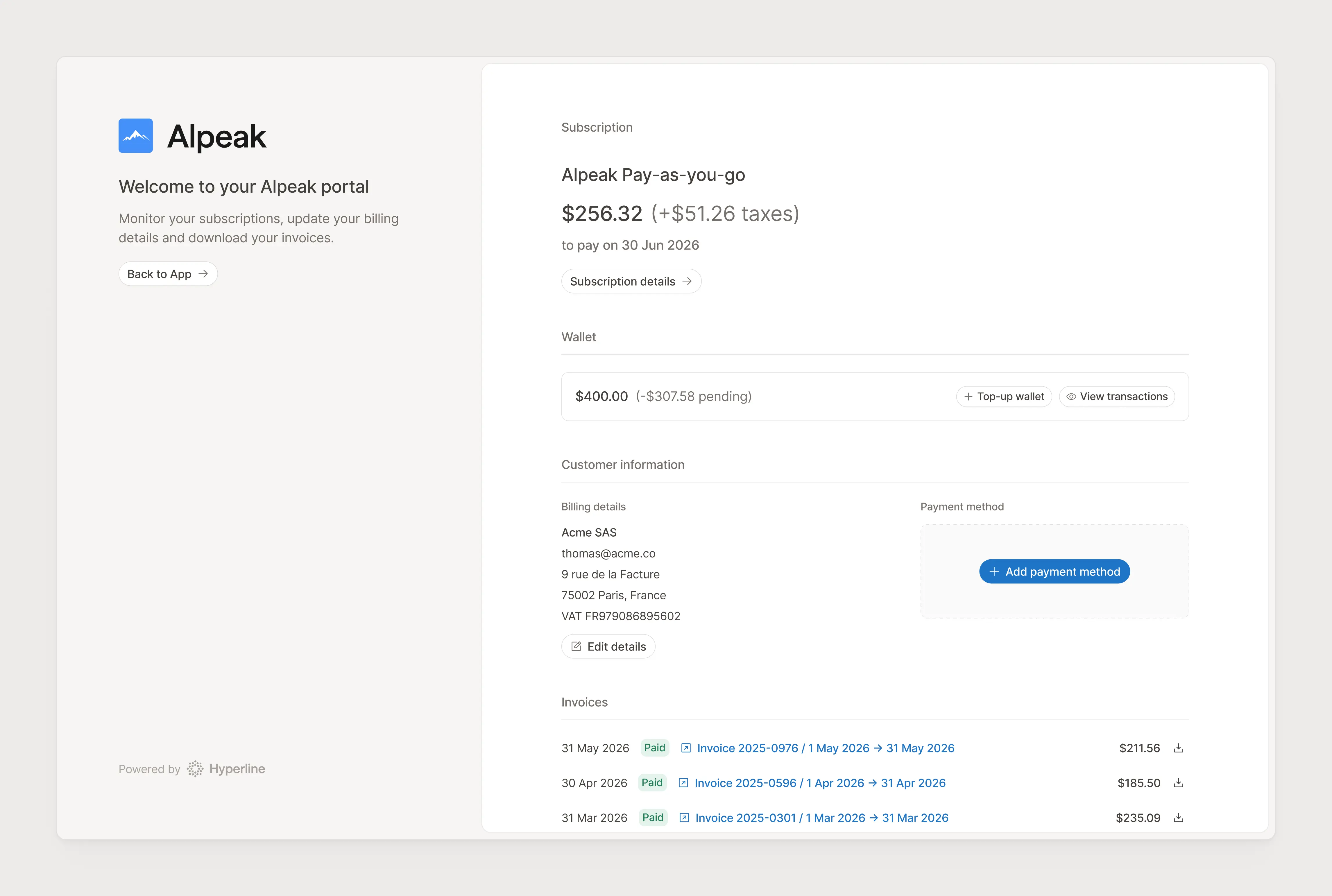
Every customer on Hyperline gets its own portal where they can vieuw their subscription details, edit their billing and payment information and access their invoice history.
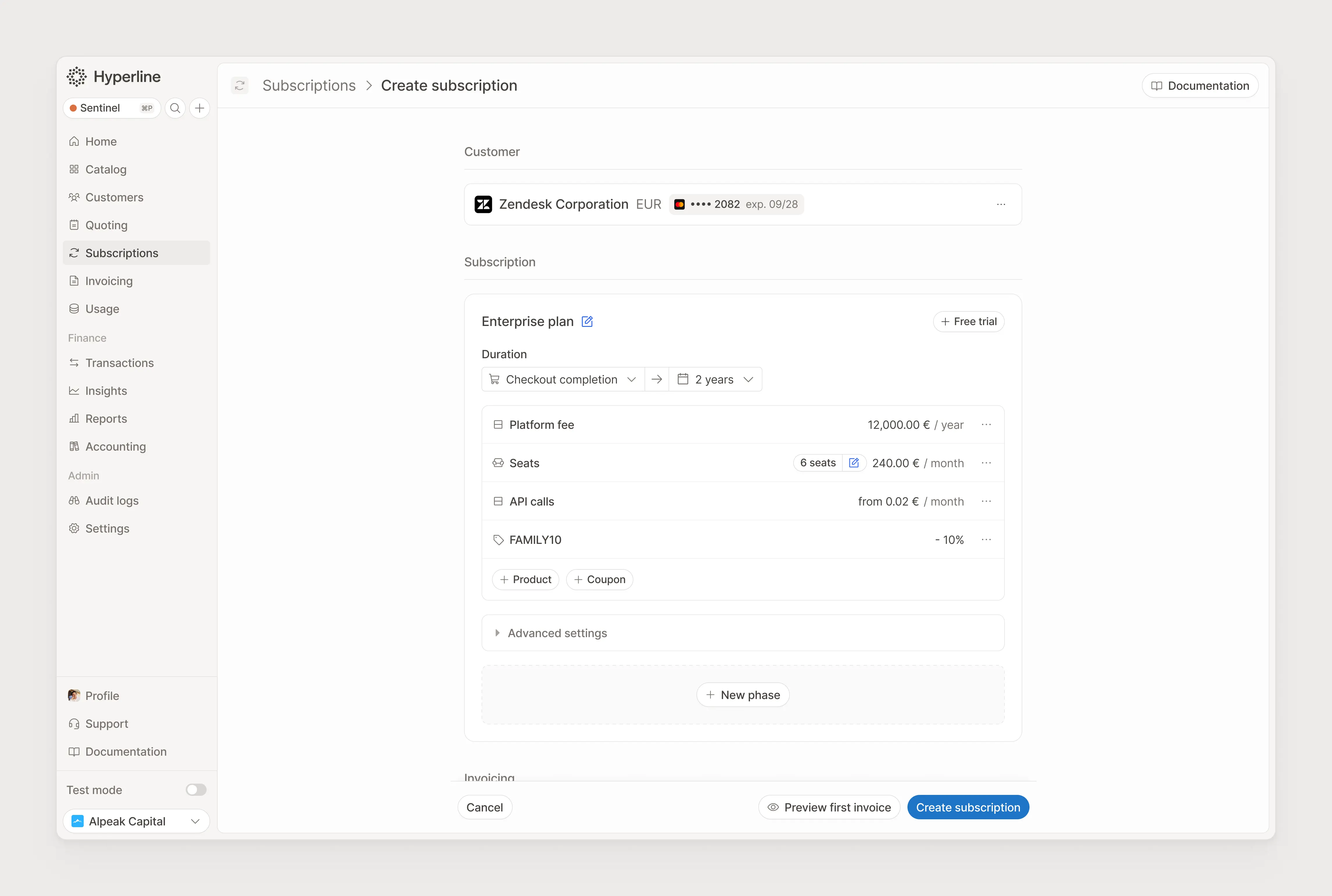
Creating a subscription is one of these features where the happy path must be flawless with only a few clicks, and yet the advanced options should let you go in a deep level of configuration and customisation.
Our CPQ module is our true competitive advantage, allowing users to wrap our powerful billing engine in an automated quoting system, removing manual work to reproduce the subscription from the quote.
For entities that require some detailed information, we created a 2-columns view to display the entity on the right, and the whole details on the left with line items, tables and anything needed.
The form that was build around is the most customisable of our product, with a notion-inspired block builder.
We handled this by allowing users to pre-configure a subscription, and hiding the product configuration options in side-panel, yet letting the most used action, editing quantity, directly in-line.
As any fast-growing company, we’re working on a new version of our website every 12 months, so it displays our positioning and feature set accurately.
This is now the 4th version, with an objective to reassure visitors with minimalism and calm colors, while showing how we manage complexity through product illustrations.
In the early days of Hyperline, we decided to build lead magnets to bring new prospects to our website and increase our brand awareness in the very crowded billing space.
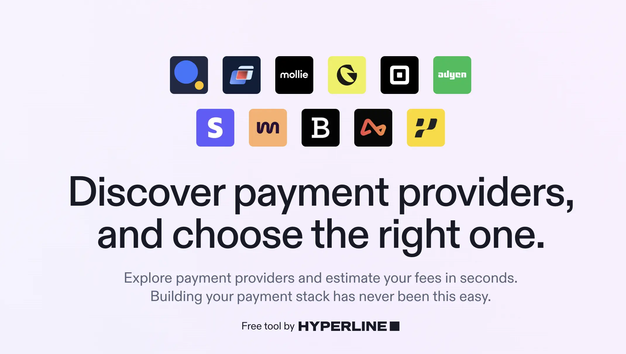
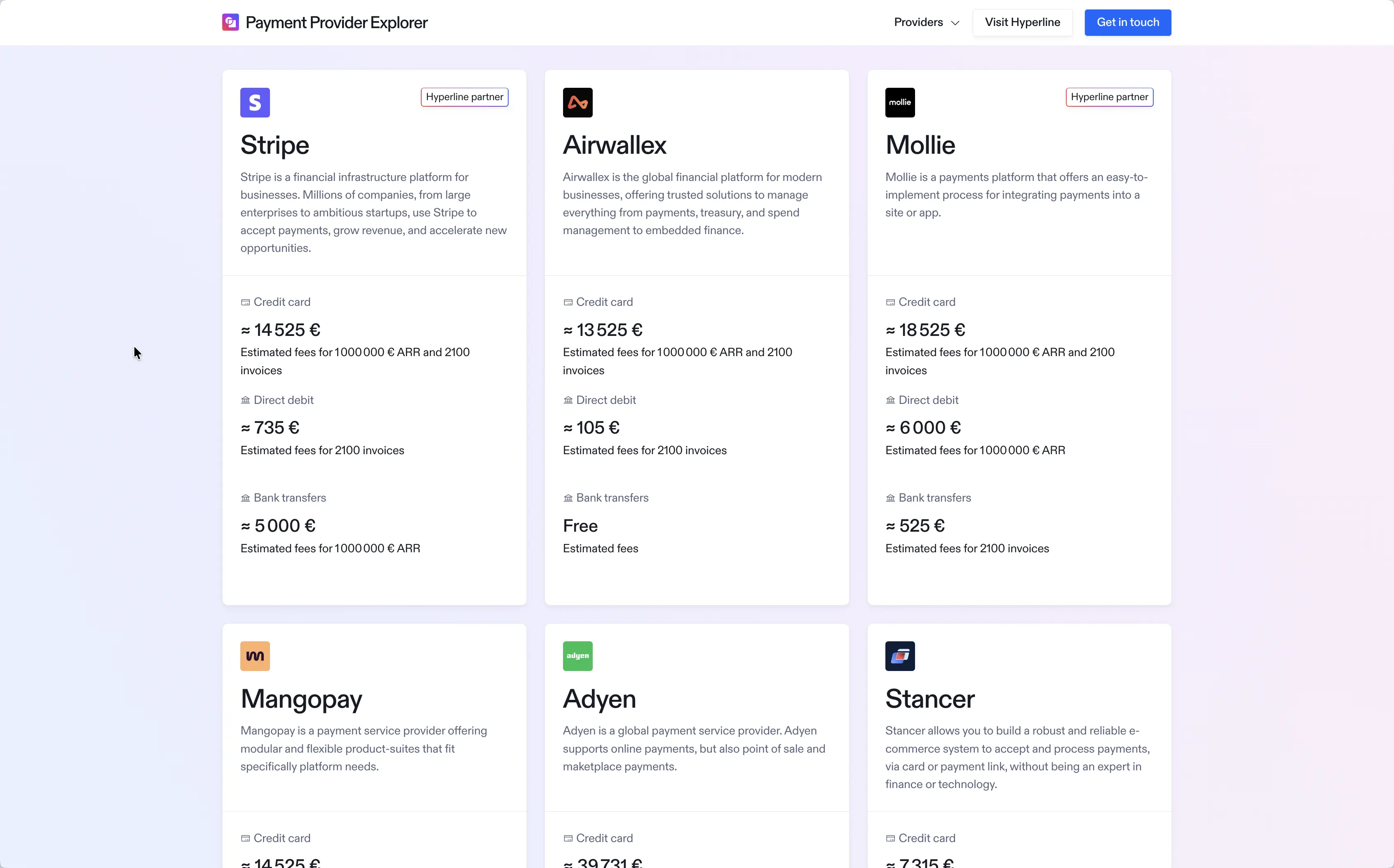
We build a simulator to compare the price of different Payment Service Providers (PSP) based on pricing and payment methods supported to help users find the best one.
Users are able to enter their estimated ARR, number of invoices issued and get an estimation of fees with every provider, comparing them in seconds instead of hours.
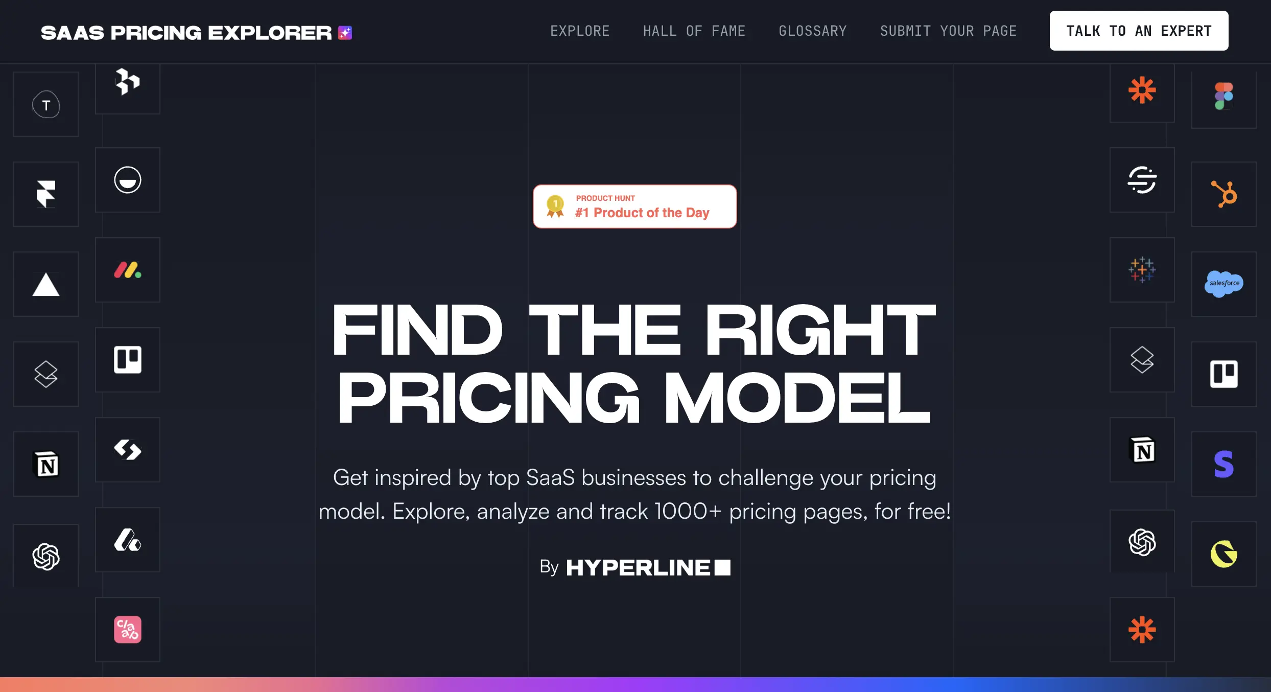
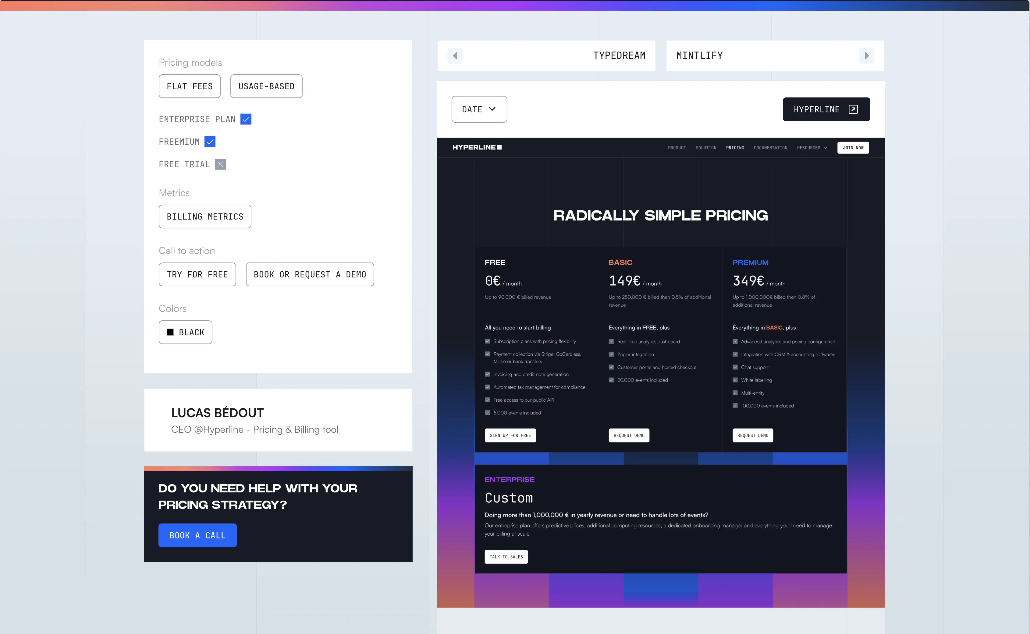
We built an open source library containing the pricing pages of 1000+ SaaS companies. This project won Product of the day on ProductHunt with > 1000 upvotes.
Each pricing page was tagged, allowing users to search, filter and sort by categories to find pricing pages to get inspiration on design, wording and pricing strategy.
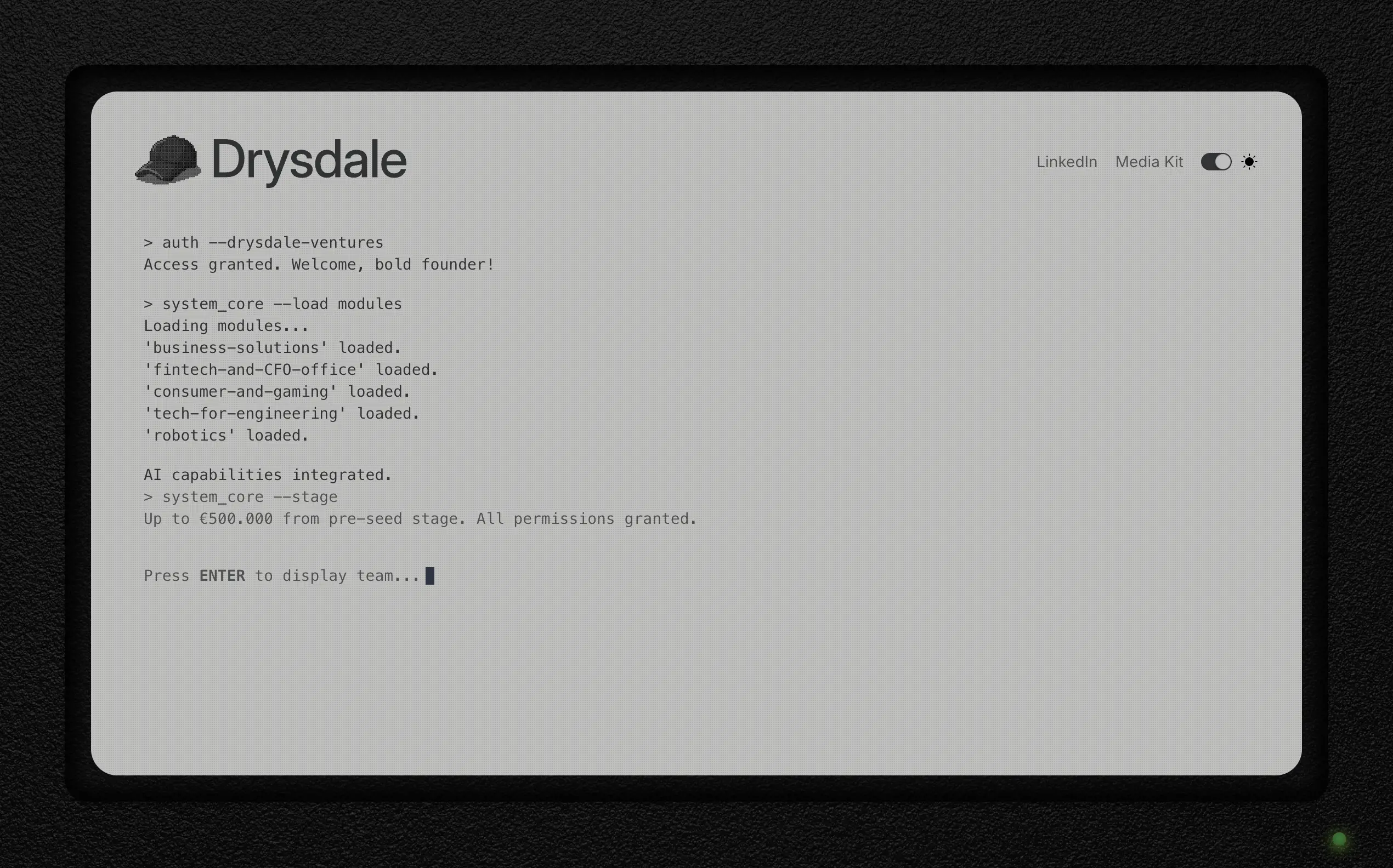
When Nicolas Essayan decided to start it’s own VC fund, he wanted it to reflect his personality ; geeky yet approchable, fun yet serious... a perfect fit for the new generation of tech founders he will be financing.
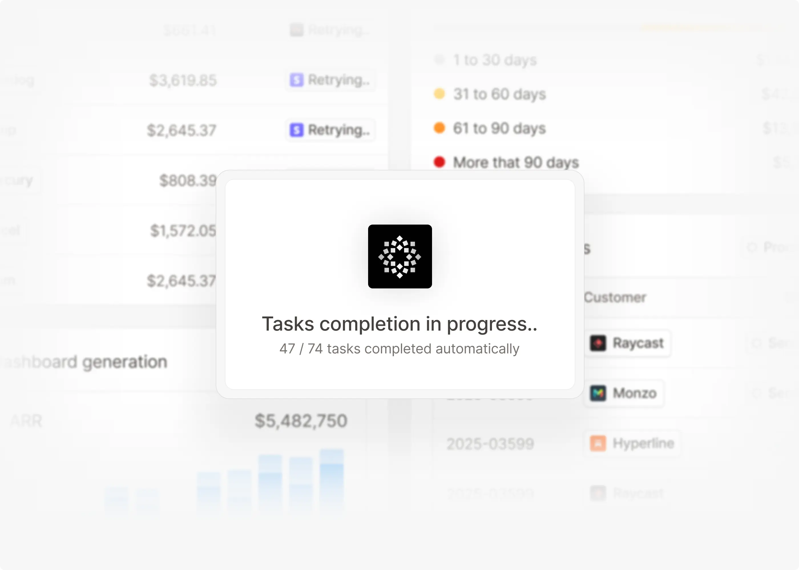
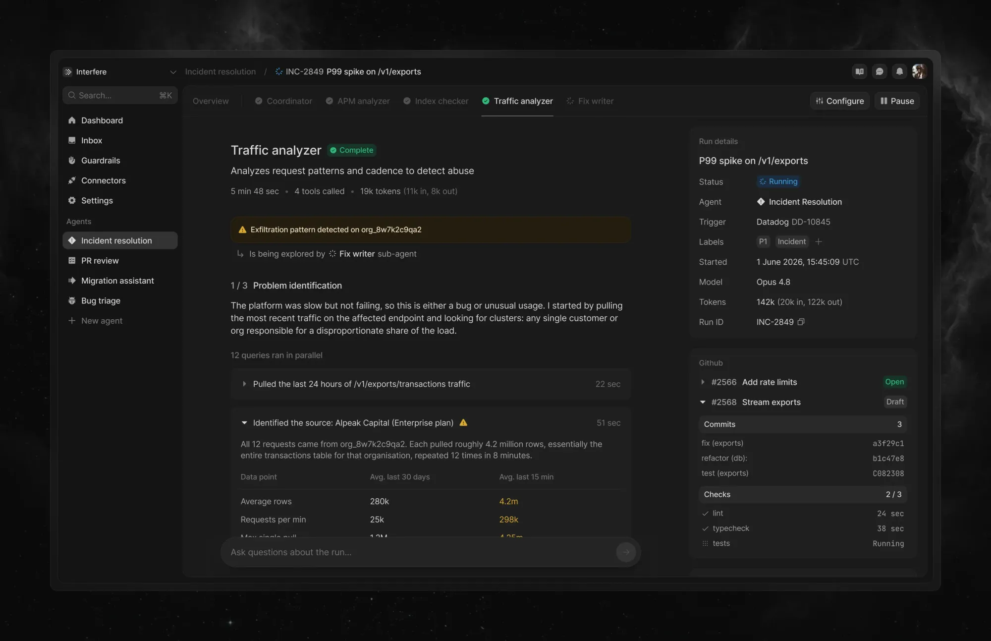
Exploration on what a minimalistic and simplified interface built to give visibility on the work done by multiple sub-agents running at the same time would look like.
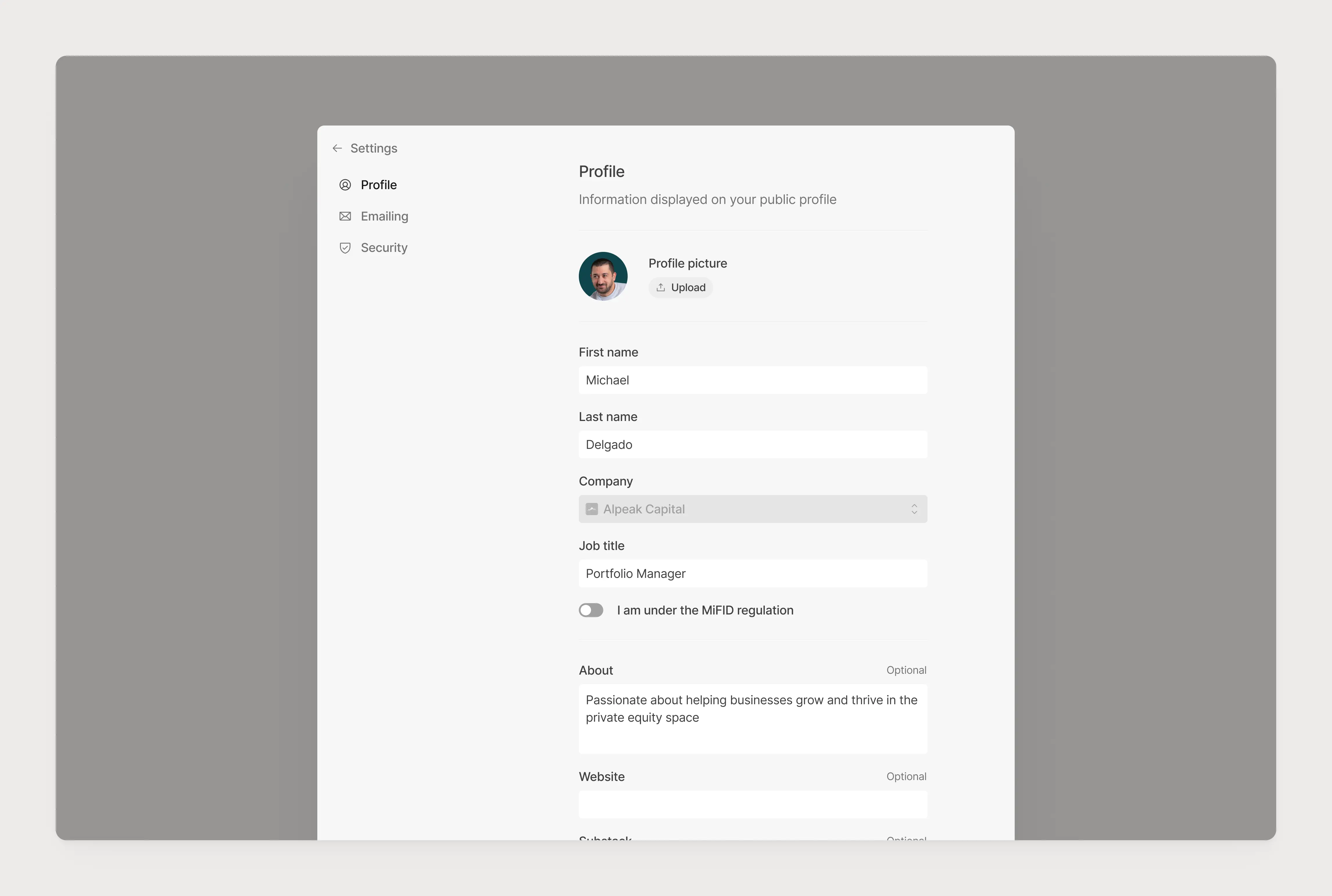
I spent the first half of 2025 working on a new platform allowing finance professionals to gather all their private research at the same place for their team to see, comment, share and get thorough AI analysis based on their role.
I opted for a very minimalistic flat design, as it was getting trendy and as a good way to start to design a platform that could end up becoming busy and complex.
When my two best friends decided to launch their real estate startup to allow non-conventional profiles to buy their first home, they needed help on the branding and design side.
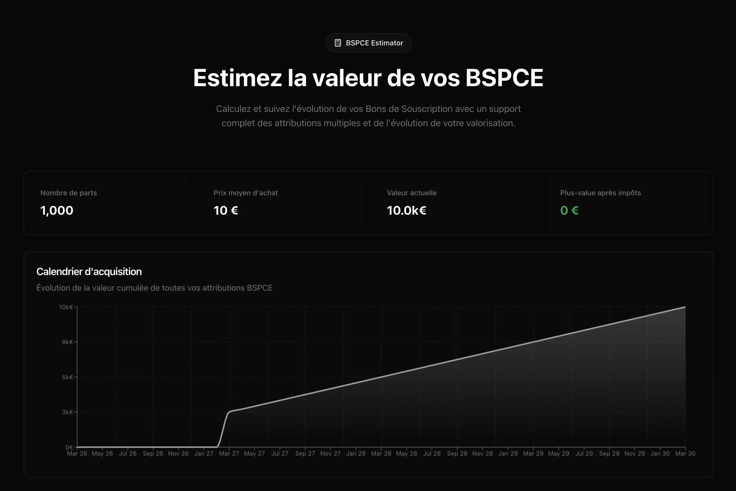
As any start-up employee wondering, I was wondering how shares I own, what’s their value, how much I vested, my potential profit... Lovable had just came out of stealth and I wanted to give it a go, so I quickly built this free tool.
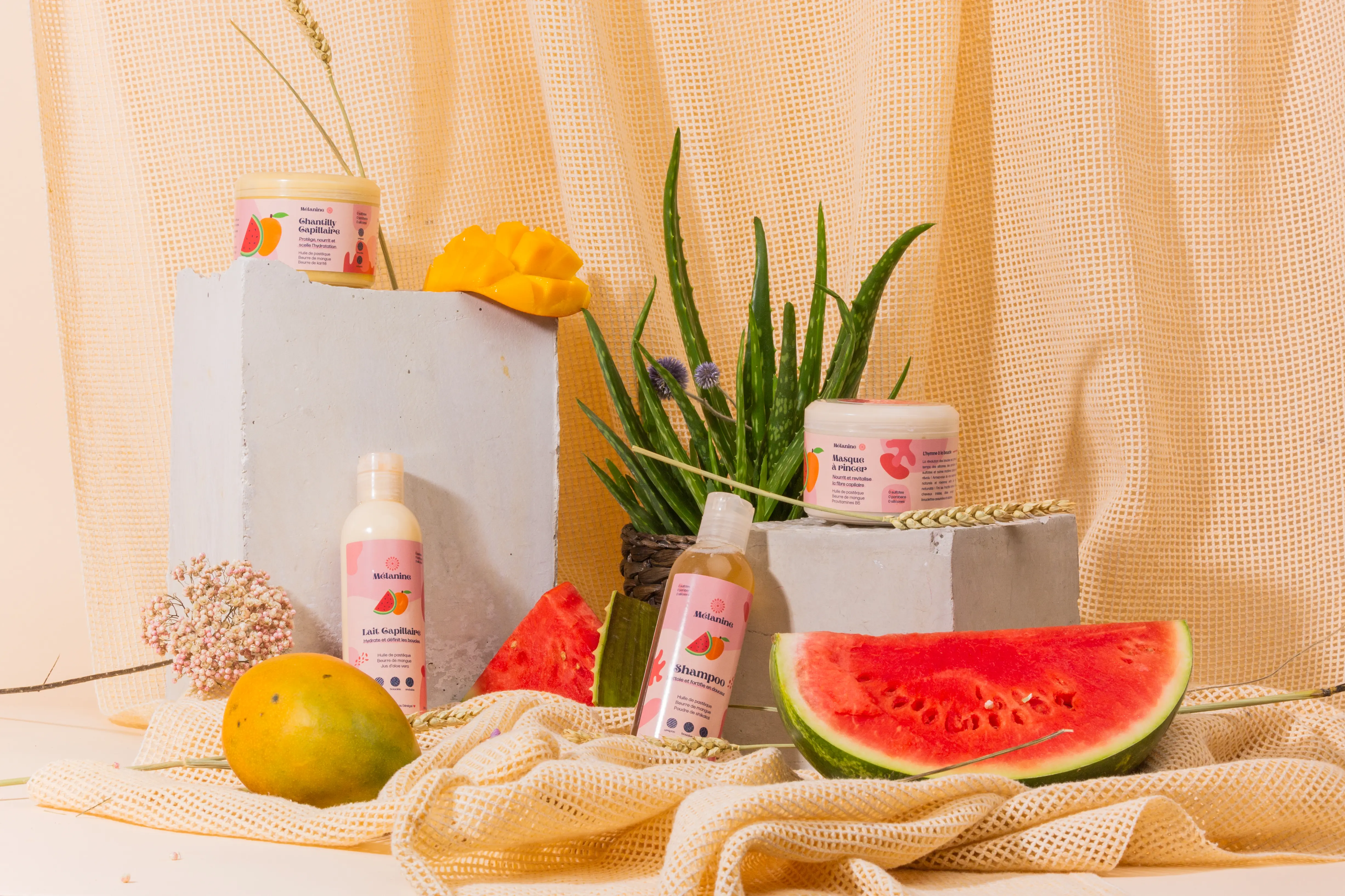
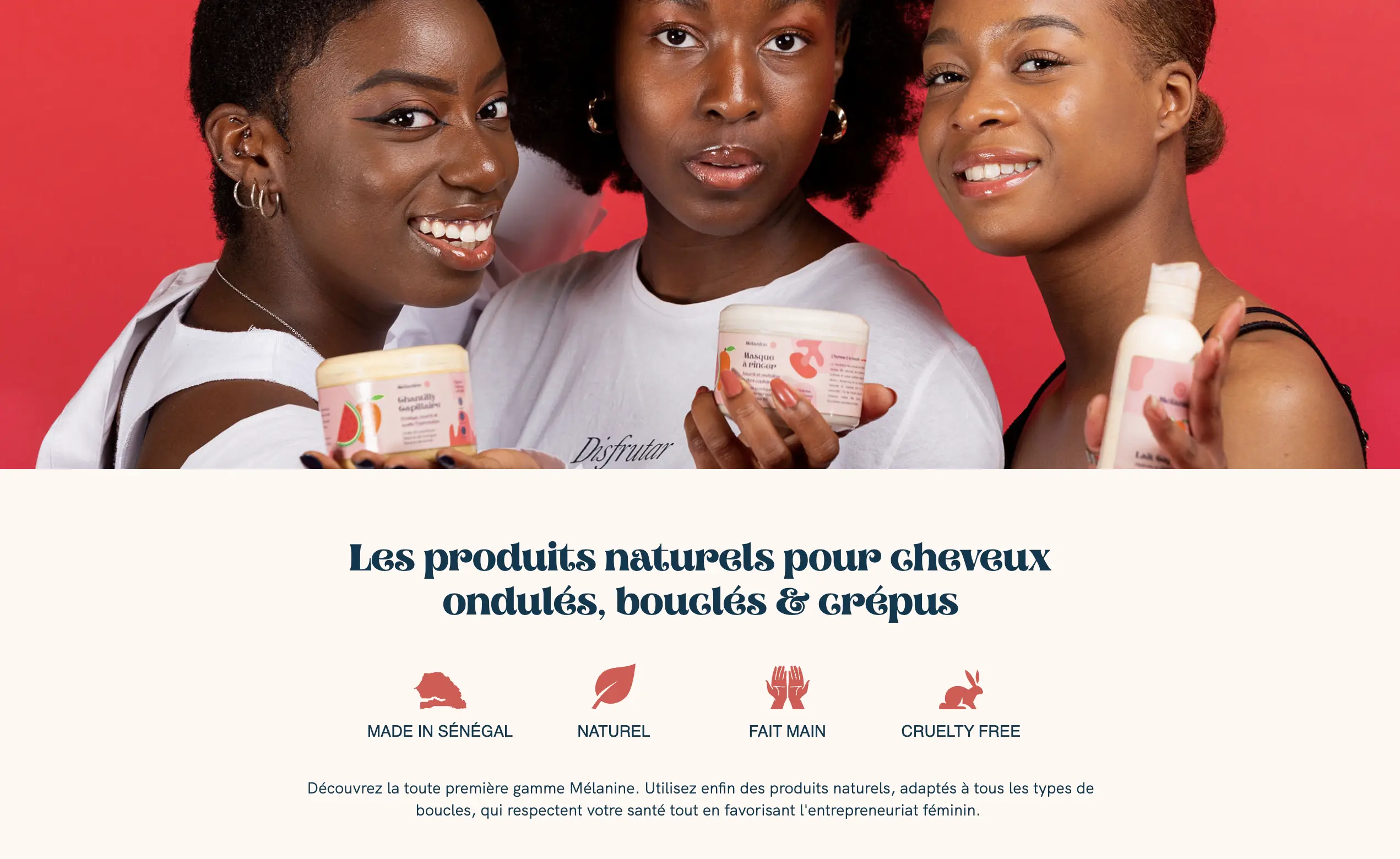
At the beginning of my career, I was interested in B2C (and honestly, just wanted to work) so I helped Camille to start a brand of hair products destined to textured hair.
I built the brand from scratch, from naming to tone of voice and brand identity, working on the packagings and everything visual-related. We launched a successful crowdfunding campaign, and shot amazing visuals with amateur models.
What about when my third best friend started his own school to train people for the new wave energy transition jobs? Of course, I gave him a hand with logo and UI kit.

A UX case study exploring how to help Airbnb travelers locate and access their accommodation more easily.

A small side project built with Lovable to help startup employees estimate the value of their company shares (BSPCE).
Visit the website to see more.

Designed and built a full e-commerce website for a coffee brand using Webflow.

Worked with Nicolas Essayan to craft the visual identity and website for his venture capital firm.
Visit the website to see more.

Designed a food blog with a fully automated CMS, making it easy for a friend to publish recipes and content.

Created the first brand identity for Hestia, a prop-tech startup, including logo, typography, and color system.

In the first few days of the product development, we heavily invested on a highly re-usable design system.
We started on Tailwind CSS base, and created our own set on atoms by taking elements here and there from libraries like Radix UI and Shadcn. This allowed us to build the first base quickly, and customise it to match our needs.
Our design system has been thought of has a very simple set of components, with the highest flexibility possible. We build atoms and layouts, and let the engineers create molecules and organisms by themselves, following a strict set of rules to create highly usable interfaces and patterns.
Hyperline is a heavy forms & tables product — most like any other SaaS treating finance data — so we had to build components that were both

Since I joined the company in February, we iterated quite a few times on our brand. What started as something very techy quickly evolved into a SaaS that appealed to broader audiences, before taking its final shape in Q2 2025.
Visit the website to see it yourself.

For the past 3 years, I’ve been designing Hyperline from scratch. From the early ideation process until today, we shipped together with the tech team an enormous amount of features.
Visit the website or sign-up to Hyperline to see more.

Ever since we bought the domain name hyperline.co, I’ve been owning the design and experience on our website. For the lastest iteration that shipped in June 2025, I designed the website in a very minimalistic way with a polished finish, and 50+ hand designed product illustrations.
Visit the website to see for yourself.

A UX case study focused on improving La Fourche’s checkout flow to convert new registered users into first-time buyers.

Refreshed the logo and brand system for Le Crayon, a media group producing educational content on YouTube.
Visit the website to see more.

Designed the logo for L’Etincelle, a school dedicated to ecological transition.
Visit the website to see more.

A UX case study exploring how to make transaction limits more transparent for Lydia users.

Rebuilt Marble’s design system from scratch on Figma, creating a consistent component library for their product team.

Collaborated with Camille to build the Melanine cosmetics brand from the ground up, including logo, packaging, and visual identity.

Created all the visual assets for Melanine’s crowdfunding campaign on Ulule.

A tool to help SaaS companies compare and optimize their payment provider costs.
Visit the website to see more.

Designed and shipped a clean one-page website for a law firm in a single day.

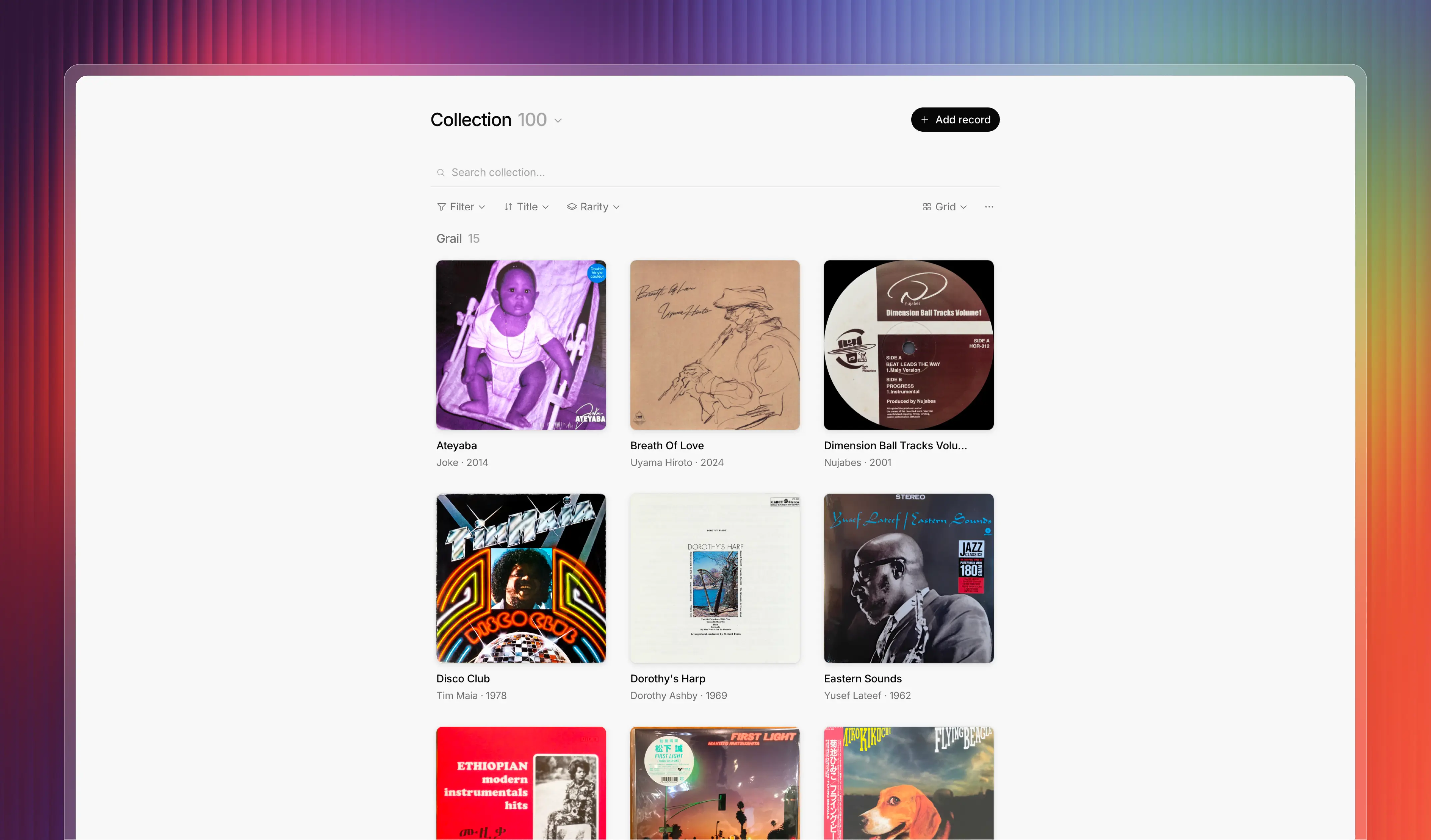
A free, open-source platform to organize, browse, and share your vinyl record collection. Built with Discogs integration and AI-powered search.
Visit the website to see more.

A directory of 1000+ SaaS pricing pages and their evolution over time, helping product teams benchmark their pricing.
Visit the website to see more.

Redesigned the sign-up and KYC onboarding flow for Shine, improving the experience for both B2B and B2C users.

Detail page content coming soon.